<!doctype html>
<html>
<head>
<meta charset="utf-8">
<meta name="viewport" content="width=device-width,initial-sacle=1,user-scalable=0"/>
<title>无标题文档</title>
<link href="../css/jquery.mobile-1.4.2.min.css" rel="stylesheet" type="text/css"/>
<link href="../css/slick.css" rel="stylesheet" type="text/css">
<script src="../js/jquery.js" type="text/javascript"></script>
<script src="../js/jquery.mobile-1.4.2.min.js" type="text/javascript"></script>
<script src="../js/slick.min.js"></script>
<style>
#pmain{
width:100%;
height:100%;
}
#mainAdv{
width:100%;
height:40%;
}
#mainAdv div{
height:100%;
}
#mainAdv img{
height:100%;
}
#games{
width:100%;
height:30%;
}
#games img{
-webkit-border-radius: 20px;
-moz-border-radius: 20px;
border-radius: 0.5em;
margin:auto;
}
#games table{
width:100%;
height:100%;
}
#games td{
width:25%;
text-align:center;
}
#footer{
display:flex;
display:-webkit-flex;
width:100%;
height:30%;
font-size:1.5em;
}
#fleft{
flex: 2;
-webkit-flex: 2;
width:100%;
height:100%;
display:flex;
display:-webkit-flex;
flex-direction:column;
-webkit-flex-direction:column;
text-align:center;
line-height:2.5em;
}
#fright{
width:100%;
height:100%;
flex: 1;
-webkit-flex: 1;
display:flex;
display:-webkit-flex;
flex-direction:column;
-webkit-flex-direction:column;
text-align:center;
line-height:3em;
}
</style>
<script>
$(function(){
$('.slick').slick({
accessibility: true,
/*dots: true,*/
arrows: true,
autoplay: true,
autoplaySpeed: 2000,
pauseOnHover: true,
touchMove: true,
fade: true,
centerMode: true
});
});
</script>
</head>
<div id="pmain" data-role="page" data-fullscreen="true">
<div id="mainAdv" data-role="header">
<div class="slick">
<div><a href="#"><img src="../images/j200.png" alt="" width="100%"></a></div>
<div><a href="#"><img src="../images/j201.png" alt="" width="100%"></a></div>
<div><a href="#"><img src="../images/j200.png" alt="" width="100%"></a></div>
<div><a href="#"><img src="../images/j201.png" alt="" width="100%"></a></div>
</div>
</div>
<div id="games">
<table>
<tr>
<td><a href="#"><img src="../images/j100.png" alt="" width="90%"></td>
<td><a href="#"><img src="../images/j100.png" alt="" width="90%"></td>
<td><a href="#"><img src="../images/j100.png" alt="" width="90%"></td>
<td><a href="#"><img src="../images/j100.png" alt="" width="90%"></td>
</tr>
<tr>
<td>
<a href="#"><img src="../images/j100.png" alt="" width="90%">
</td>
<td>
<a href="#"><img src="../images/j100.png" alt="" width="90%">
</td>
<td>
<a href="#"><img src="../images/j100.png" alt="" width="90%">
</td>
<td>
<a href="#"><img src="../images/j100.png" alt="" width="90%">
</td>
</tr>
</table>
</div>
<div id="footer">
<div id="fleft">
<div style="height:33.333%; width:100%; background-color:#0CC;"><marquee>这是跑马灯啊</marquee></div>
<div style="height:66.666%; width:100%;"><a href="#"><img src="../images/j201.png" width="100%" height="100%;"></a></div>
</div>
<div id="fright">
<div style="height:33.333%; width:100%; background-color:#0C9">按钮1</div>
<div style="height:33.333%; width:100%; background-color:#0FF">按钮2</div>
<div style="height:33.333%; width:100%; background-color:#0FC">按钮3</div>
</div>
</div>
</div>
<body>
</body>
</html>
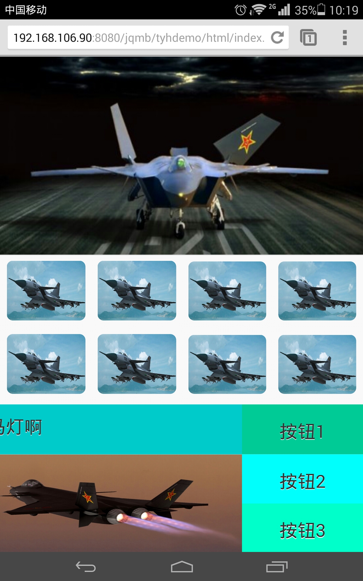
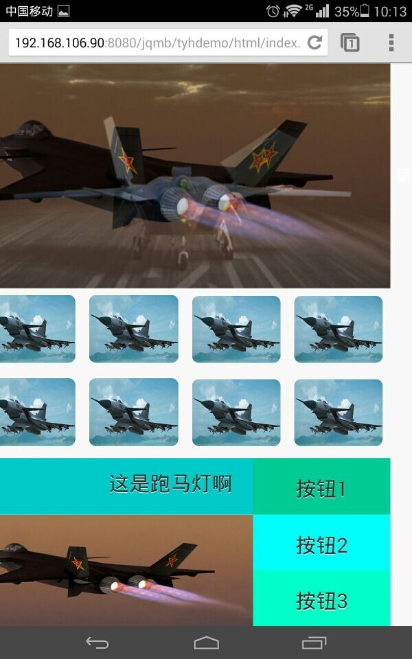
页面主要有3个div组成,高度分别为40% 30% 30%;但是在手机浏览器中把页面向左滑,会出来一块空白,如图2,如果把三个div的高度改一下,随便改一个,让他们加起来不等于100%,不大于98%,就不会出现那个问题,谁能帮解答一下?


 发帖
发帖 与我相关
与我相关 我的任务
我的任务
 分享
分享
