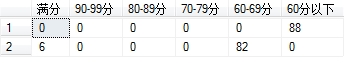
这是一个我统计后sql的结果,代码是
select count(case Score when 100 then 1 end) as [满分],
count(case when Score between 90 and 99 then 1 end) as[90-99分],
count(case when Score between 80 and 89 then 1 end) as[80-89分],
count(case when Score between 70 and 79 then 1 end) as[70-79分],
count(case when Score between 60 and 69 then 1 end) as[60-69分],
count(case when Score<60 then 1 end) as[60分以下]
from Score
UNION
select count(case xingce when 100 then 1 end) as [满分],
count(case when xingce between 90 and 99 then 1 end) as[90-99分],
count(case when xingce between 80 and 89 then 1 end) as[80-89分],
count(case when xingce between 70 and 79 then 1 end) as[70-79分],
count(case when xingce between 60 and 69 then 1 end) as[60-69分],
count(case when xingce<60 then 1 end) as[60分以下]
from Score
怎样使这么一个结果可以显示在chart控件上?
目前我所知道的好像是chart只能绑定列


 发帖
发帖 与我相关
与我相关 我的任务
我的任务
 分享
分享


