图
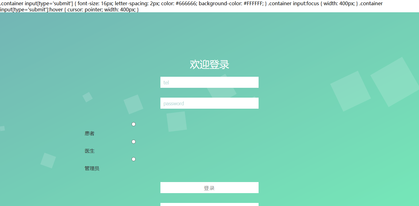
还有上面的那两行代码为啥会出现。。。
代码(部分转载,侵权请联系)
<%@ page contentType="text/html;charset=UTF-8" language="java" %>
<!DOCTYPE html>
<html>
<head lang="en">
<meta charset="UTF-8">
<title>聚医--注册</title>
<style type="text/css">
* {
box-sizing: border-box;
}
body {
margin: 0;
padding: 0;
font: 16px/20px microsft yahei;
}
.wrap {
width: 100%;
height: 100%;/*全铺*/
padding: 10% 0;
position: fixed;
opacity: 0.8;
background: linear-gradient(to bottom right,#50a3a2,#53e3a6);
background: -webkit-linear-gradient(to bottom right,#50a3a2,#53e3a6);
}
.container {
width: 60%;
margin: 0 auto;
}
.container h1 {
text-align: center;
color: #FFFFFF;
font-weight: 500;
}
.container input {
width: 320px;
display: block;
height: 36px;
border: 0;
outline: 0;
padding: 6px 10px;
line-height: 24px;
margin: 32px auto;
-webkit-transition: all 0s ease-in 0.1ms;
-moz-transition: all 0s ease-in 0.1ms;
transition: all 0s ease-in 0.1ms;
}
.container input[type="text"] , .container input[type="password"] {
background-color: #FFFFFF;
font-size: 16px;
color: #50a3a2;
}
.container input[type="radio"]{
font-size: 16px;
vertical-align: middle;
margin-top: 0px;
margin-bottom: 0px;
}
.container input[type='submit'] {
font-size: 16px;
letter-spacing: 2px;
color: #666666;
background-color: #FFFFFF;
}
.container input:focus {
width: 400px;
}
.container input[type='submit']:hover {
cursor: pointer;
width: 400px;
}
.wrap ul {
position: absolute;
top: 0;
left: 0;
width: 100%;
height: 100%;
z-index: -10;
}
.wrap ul li {
list-style-type: none;
display: block;
position: absolute;
bottom: -120px;
width: 15px;
height: 15px;
z-index: -8;
background-color:rgba(255, 255, 255, 0.15);
animotion: square 25s infinite;
-webkit-animation: square 25s infinite;
}
.wrap ul li:nth-child(1) {
left: 0;
animation-duration: 10s;
-moz-animation-duration: 10s;
-o-animation-duration: 10s;
-webkit-animation-duration: 10s;
}
.wrap ul li:nth-child(2) {
width: 40px;
height: 40px;
left: 10%;
animation-duration: 15s;
-moz-animation-duration: 15s;
-o-animation-duration: 15s;
-webkit-animation-duration: 15s;
}
.wrap ul li:nth-child(3) {
left: 20%;
width: 25px;
height: 25px;
animation-duration: 12s;
-moz-animation-duration: 12s;
-o-animation-duration: 12s;
-webkit-animation-duration: 12s;
}
.wrap ul li:nth-child(4) {
width: 50px;
height: 50px;
left: 30%;
-webkit-animation-delay: 3s;
-moz-animation-delay: 3s;
-o-animation-delay: 3s;
animation-delay: 3s;
animation-duration: 12s;
-moz-animation-duration: 12s;
-o-animation-duration: 12s;
-webkit-animation-duration: 12s;
}
.wrap ul li:nth-child(5) {
width: 60px;
height: 60px;
left: 40%;
animation-duration: 10s;
-moz-animation-duration: 10s;
-o-animation-duration: 10s;
-webkit-animation-duration: 10s;
}
.wrap ul li:nth-child(6) {
width: 75px;
height: 75px;
left: 50%;
-webkit-animation-delay: 7s;
-moz-animation-delay: 7s;
-o-animation-delay: 7s;
animation-delay: 7s;
}
.wrap ul li:nth-child(7) {
left: 60%;
animation-duration: 8s;
-moz-animation-duration: 8s;
-o-animation-duration: 8s;
-webkit-animation-duration: 8s;
}
.wrap ul li:nth-child(8) {
width: 90px;
height: 90px;
left: 70%;
-webkit-animation-delay: 4s;
-moz-animation-delay: 4s;
-o-animation-delay: 4s;
animation-delay: 4s;
}
.wrap ul li:nth-child(9) {
width: 100px;
height: 100px;
left: 80%;
animation-duration: 20s;
-moz-animation-duration: 20s;
-o-animation-duration: 20s;
-webkit-animation-duration: 20s;
}
.wrap ul li:nth-child(10) {
width: 120px;
height: 120px;
left: 90%;
-webkit-animation-delay: 6s;
-moz-animation-delay: 6s;
-o-animation-delay: 6s;
animation-delay: 6s;
animation-duration: 30s;
-moz-animation-duration: 30s;
-o-animation-duration: 30s;
-webkit-animation-duration: 30s;
}
@keyframes square {
0% {
-webkit-transform: translateY(0);
transform: translateY(0)
}
100% {
bottom: 400px;
transform: rotate(600deg);
-webit-transform: rotate(600deg);
-webkit-transform: translateY(-500);
transform: translateY(-500)
}
}
@-webkit-keyframes square {
0% {
-webkit-transform: translateY(0);
transform: translateY(0)
}
100% {
bottom: 400px;
transform: rotate(600deg);
-webit-transform: rotate(600deg);
-webkit-transform: translateY(-500);
transform: translateY(-500)
}
}
</style>
</head>
<body>
<div class="wrap">
<div class="container">
<h1>欢迎登录</h1>
<form>
<tr>
<td>
<input type="text" placeholder="tel"/>
</td>
</tr>
<tr>
<td>
<input type="password" placeholder="password"/>
</td>
</tr>
<table style="padding-left: inherit">
<tr>
<td>
<label style="float: left;font-size: 16px;">
<input type="radio" style="vertical-align: auto;margin-top: -2px;margin-bottom: 0.1px" name="type" value="患者" ><span class="text">患者</span></label>
<label style="font-size: 16px;">
<input type="radio" style="vertical-align: auto;margin-top: -2px;margin-bottom: 0.1px" name="type" value="医生" >医生<input type="radio" name="type" value="管理员" >管理员</label>
</td>
</tr>
</table>
<tr>
<td>
<input type="submit" value="登录"/>
</td>
</tr>
<tr>
<td>
<input type="submit" value="忘记密码"/>
</td>
</tr>
<tr>
<td>
<p class="change_link" align="center">
<span class="text">没有账户 ?</span>
<a href="login.html" class="to_login">立即注册 </a>
</p>
</td>
</tr>
</form>
</div>
<ul>
<li></li>
<li></li>
<li></li>
<li></li>
<li></li>
<li></li>
<li></li>
<li></li>
<li></li>
<li></li>
</ul>
</div>
</body>
</html>


 发帖
发帖 与我相关
与我相关 我的任务
我的任务
 分享
分享

