一个简单效果,看图,该如何实现呢?

自渡96 2020-05-22 11:54:53
这样的效果应该如何实现呢?(要求不能直接用图片)
...全文
271 9 打赏 收藏 转发到动态 举报
AI 作业
写回复
用AI写文章
9 条回复
切换为时间正序
请发表友善的回复…
发表回复
自渡96 2020-05-22
  • 打赏
  • 举报
回复
引用 1 楼 Let dreams fly 的回复:
<div class="content"></div>
.content {
	position: relative;
	border: 2px solid red;
	width: 200px;
	height: 100px;
	overflow: hidden;
	border-top: none;
}

.content::before {
	content: "";
	position: absolute;
	width: 100px;
	left: 50px;
	height: 50px;
	border-radius: 60%;
	border: 2px solid red;
	top: -30px;
	background-color: white;
	z-index: 2;
}

.content::after {
	content: "";
	position: absolute;
	width: 100%;
	top: 0;
	border:2px solid red;
	z-index: 1;
}
箭头处的弧形没有处理到啊
Let dreams fly 2020-05-22
  • 打赏
  • 举报
回复
<div class="content"></div>
.content {
	position: relative;
	border: 2px solid red;
	width: 200px;
	height: 100px;
	overflow: hidden;
	border-top: none;
}

.content::before {
	content: "";
	position: absolute;
	width: 100px;
	left: 50px;
	height: 50px;
	border-radius: 60%;
	border: 2px solid red;
	top: -30px;
	background-color: white;
	z-index: 2;
}

.content::after {
	content: "";
	position: absolute;
	width: 100%;
	top: 0;
	border:2px solid red;
	z-index: 1;
}
天际的海浪 2020-05-22
  • 打赏
  • 举报
回复

<canvas id="canvasId" width="500" height="200"></canvas>
<script type="text/javascript">
var canvas = document.getElementById("canvasId");
var ctx = canvas.getContext("2d");
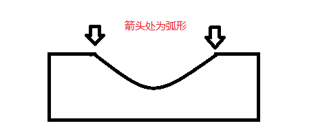
ctx.beginPath();
ctx.moveTo(400,2);
ctx.lineTo(498,2);
ctx.lineTo(498,198);
ctx.lineTo(2,198);
ctx.lineTo(2,2);
ctx.lineTo(100,2);
ctx.bezierCurveTo(150,2,150,100,250,100);
ctx.bezierCurveTo(350,100,350,2,400,2);
ctx.closePath();
ctx.stroke();
</script>
自渡96 2020-05-22
  • 打赏
  • 举报
回复
引用 7 楼 天际的海浪 的回复:
[quote=引用 5 楼 自渡96 的回复:] [quote=引用 4 楼 天际的海浪 的回复:] canvas或svg绘图很简单的
就是不会画,所以才想用css实现。结果箭头的位置不会处理[/quote] 这种图形用css实现岂不是更麻烦。[/quote] 这不是没有办法了嘛
天际的海浪 2020-05-22
  • 打赏
  • 举报
回复
引用 5 楼 自渡96 的回复:
[quote=引用 4 楼 天际的海浪 的回复:] canvas或svg绘图很简单的
就是不会画,所以才想用css实现。结果箭头的位置不会处理[/quote] 这种图形用css实现岂不是更麻烦。
自渡96 2020-05-22
  • 打赏
  • 举报
回复
引用 3 楼 潇湘忆梦 的回复:

body {
            background-image: url('image/16e121fdec95660f.jpg');
        }

        .square, .square > div {
            box-sizing: border-box;
        }

        .square {
            width: 300px;
            position: fixed;
            top: calc(50vh - 200px);
            left: calc(50vw - 150px);
            overflow: hidden;
        }

            .square > .s-top {
                border: 1px solid #fff;
                height: 170px;
                border-radius: 5px 5px 0 0;
                border-width: 1px 1px 0 1px;
            }

            .square > .s-middle {
                border-left: 1px solid #fff;
                height: 60px;
            }

            .square > .s-bottom {
                border: 1px solid #fff;
                height: 170px;
                border-radius: 0 0 5px 5px;
                border-width: 0px 1px 1px 1px;
            }

            .square > .s-half-circle {
                border: 1px solid #fff;
                position: absolute;
                width: 30px;
                height: 60px;
                border-width: 1px 0px 1px 1px;
                border-radius: 30px 0 0 30px;
                top: calc(50% - 30px);
                right: 0;
            }

            .square > .s-background {
                border: 360px solid rgba(255,255,255,0.3);
                position: absolute;
                width: 780px;
                height: 780px;
                border-radius: 50%;
                top: calc(50% - 390px);
                right: -390px;
            }

        .circle {
            width: 50px;
            height: 50px;
            border: 1px solid #fff;
            border-radius: 50%;
            position: absolute;
            top: calc(50% - 25px);
            left: calc(50% + 125px);
            background-color: rgba(255,255,255,.3);
            box-sizing: border-box;
        }

    <div class="square">
        <div class="s-top"></div>
        <div class="s-middle"></div>
        <div class="s-bottom"></div>
        <div class="s-half-circle"></div>
        <div class="s-background"></div>
    </div>
    <div class="circle"></div>
这样的效果我会,主要是我图片箭头部分不会处理
自渡96 2020-05-22
  • 打赏
  • 举报
回复
引用 4 楼 天际的海浪 的回复:
canvas或svg绘图很简单的
就是不会画,所以才想用css实现。结果箭头的位置不会处理
天际的海浪 2020-05-22
  • 打赏
  • 举报
回复
canvas或svg绘图很简单的
潇湘忆梦 2020-05-22
  • 打赏
  • 举报
回复

body {
            background-image: url('image/16e121fdec95660f.jpg');
        }

        .square, .square > div {
            box-sizing: border-box;
        }

        .square {
            width: 300px;
            position: fixed;
            top: calc(50vh - 200px);
            left: calc(50vw - 150px);
            overflow: hidden;
        }

            .square > .s-top {
                border: 1px solid #fff;
                height: 170px;
                border-radius: 5px 5px 0 0;
                border-width: 1px 1px 0 1px;
            }

            .square > .s-middle {
                border-left: 1px solid #fff;
                height: 60px;
            }

            .square > .s-bottom {
                border: 1px solid #fff;
                height: 170px;
                border-radius: 0 0 5px 5px;
                border-width: 0px 1px 1px 1px;
            }

            .square > .s-half-circle {
                border: 1px solid #fff;
                position: absolute;
                width: 30px;
                height: 60px;
                border-width: 1px 0px 1px 1px;
                border-radius: 30px 0 0 30px;
                top: calc(50% - 30px);
                right: 0;
            }

            .square > .s-background {
                border: 360px solid rgba(255,255,255,0.3);
                position: absolute;
                width: 780px;
                height: 780px;
                border-radius: 50%;
                top: calc(50% - 390px);
                right: -390px;
            }

        .circle {
            width: 50px;
            height: 50px;
            border: 1px solid #fff;
            border-radius: 50%;
            position: absolute;
            top: calc(50% - 25px);
            left: calc(50% + 125px);
            background-color: rgba(255,255,255,.3);
            box-sizing: border-box;
        }

    <div class="square">
        <div class="s-top"></div>
        <div class="s-middle"></div>
        <div class="s-bottom"></div>
        <div class="s-half-circle"></div>
        <div class="s-background"></div>
    </div>
    <div class="circle"></div>

61,128

社区成员

发帖
与我相关
我的任务
社区描述
层叠样式表(英文全称:Cascading Style Sheets)是一种用来表现HTML(标准通用标记语言的一个应用)或XML(标准通用标记语言的一个子集)等文件样式的计算机语言。
社区管理员
  • HTML(CSS)社区
加入社区
  • 近7日
  • 近30日
  • 至今
社区公告
暂无公告

试试用AI创作助手写篇文章吧