

61,123
社区成员
 发帖
发帖 与我相关
与我相关 我的任务
我的任务
 分享
分享
<!DOCTYPE html>

<html>

<head>

  <meta charset="utf-8">

  <meta name="viewport" content="width=device-width">

  <title>JS Bin</title>

  <style type="text/css">

  *{

    background-color: red;

    background-attachment: fixed;

            background-size: 100% 100%;

            background-repeat: no-repeat;

    margin: 0;

    padding: 0;

  }

  .top{

    position:relative;

    height: 180px;

    display: flex;

  }

  .top .img{

    height: 80px;

    width: 80px;

  }


  .content{

    margin: 50px;

  }

  .content .f-row{

    display: flex;

    margin-top: 10px;

            flex-wrap:nowrap;

            flex-direction: row;

            text-align: center;

            justify-content: space-between;

  }


  .rect{

    text-align: center ;

    border-width: 1px;

            border-style: solid;

            border-color: rgb(255, 255, 255);

            width: 30%;

            height: 0;

            padding-bottom: 30%;

  }


  .w-rect{

    border-width: 1px;

            border-style: solid;

            border-color: rgb(255, 255, 255);

            width: 65%;

            height: 0;

            padding-bottom: 30%;

  }


  .content .s-row{

        display: flex;

        flex-direction: row;

        flex-wrap:nowrap;

        text-align: center;

        justify-content: space-between;


  }

  </style>

</head>

<body>

   <div class="top">

       <img src="https://profile.csdnimg.cn/3/2/4/1_nana_aoe">

       <span>注册/登录</span>

   </div>

   <div class="content">

       <div class="f-row">

           <div class="rect">还款</div>

           <div class="rect">办卡</div>

           <div class="rect">分期</div>

       </div>

       <div class="s-row">

           <div class="w-rect">额度</div>

           <div class="rect">搜索</div>

       </div>

   </div>

</body>

</html>
<!DOCTYPE html>
<html>
<head>
  <meta charset="utf-8">
  <meta name="viewport" content="width=device-width">
  <title>JS Bin</title>
  <link rel="stylesheet" href="https://at.alicdn.com/t/font_604099_a2je1wkyy5xhto6r.css" />
  <style type="text/css">
 *{
    margin: 0;
    padding: 0;
  }
  html,body{
    height: 100%;
  }
  body{
    background: url(../cropper_/images/bg2.fc8f54d0.jpg) center no-repeat;
    background-size: cover;
  }
  .top{
    position:relative;
    height: 180px;
    display: flex;
  }
  .top .img{
    height: 80px;
    width: 80px;
  }

  .content{
    position: fixed;
    margin: 20px;
    left: 0;
    bottom: 0;
    right: 0;
  }
  .content .f-row{
    display: flex;
    flex-wrap:nowrap;
    flex-direction: row;
    text-align: center;
    justify-content: space-between;
  }

  .rect{
    text-align: center ;
    width: 33.333%;
    height: 0;
    padding-bottom: 33.33%;
    position: relative;

  }

  .w-rect{
    flex: 1;
  }

  .content .s-row{
        display: flex;
        flex-direction: row;
        flex-wrap:nowrap;
        text-align: center;
        justify-content: space-between;

  }
  .rect div{
    position: absolute;
    left: 5px;top: 5px;right: 5px;bottom: 5px;
    border: 1px solid #fff;
    background: rgba(255,255,255,.3);
    display: flex;
    flex-direction: column;
    justify-content: center;
  }
  .rect div i{
    font-family: 'iconfont';
    font-size: 40px;
    color: #fff;
  }

  .rect div span{
    font-weight: 700;
    color: #fff;
  }
  </style>
</head>
<body>
   <div class="top">
       <img src="https://profile.csdnimg.cn/3/2/4/1_nana_aoe">
       <span>注册/登录</span>
   </div>
   <div class="content">
       <div class="f-row">
           <div class="rect">
            <div><i class="iconfont icon-camera"></i><span>还款</span></div>
          </div>
           <div class="rect"><div><i class="iconfont icon-cart"></i><span>办卡</span></div></div>
           <div class="rect"><div><i class="iconfont icon-print"></i><span>分期</span></div></div>
       </div>
       <div class="s-row">
           <div class="rect w-rect"><div><i class="iconfont icon-phone"></i><span>额度</span></div></div>
           <div class="rect"><div><i class="iconfont icon-ai-qq"></i><span>搜索</span></div></div>
       </div>
   </div>

</body>
</html>
div {
  height: 50px;
  line-height: 50px;
}
div {
  display: flex;
  align-items: center;
}
.rect {
      position: relative;
      text-align: center;
      border-width: 1px;
      border-style: solid;
      border-color: rgb(255, 255, 255);
      width: 30%;
      height: 0;
      padding-bottom: 30%;
    }
.rect text {
      position: absolute;
      top: 50%;
      left: 50%;
      transform: translate(-50%, -50%);
    }
div {
    position: relative;
    top: 50%;
}


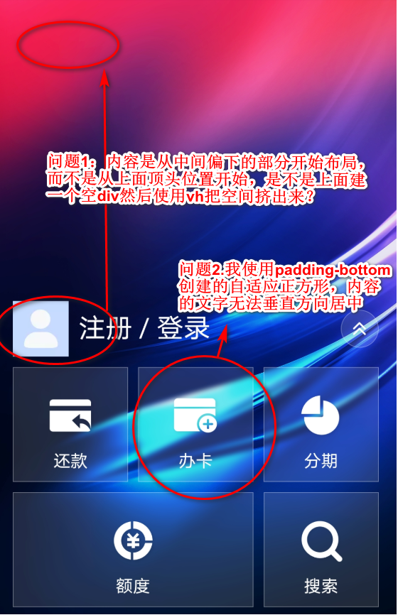
  .rect{
    border-width: 1px;
    border-style: solid;
    border-color: rgb(255, 255, 255);
    width: 30%;
    height: 0;
    padding-bottom: 30%;
  }

