


10,186
社区成员
 发帖
发帖 与我相关
与我相关 我的任务
我的任务
 分享
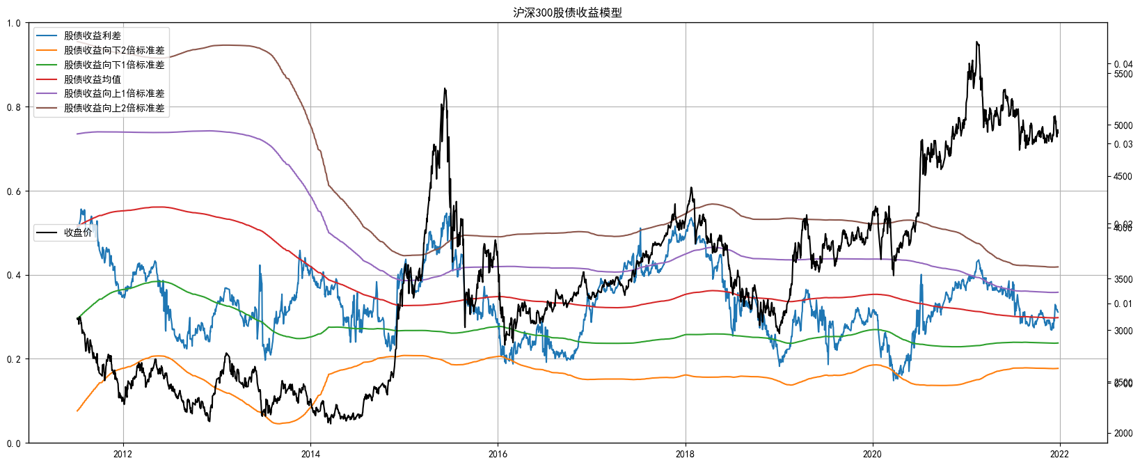
分享首先向大家介绍是股债收益模型,简单来说,就是比较国债收益率和股价的盈利收益率(Eps/price)来比较投资国债还是投资股票的性价比高。即十年期国债收益率减去股票指数股息率。一般当当前利差偏离2倍标准差后即存在比较大的机会。这也是CFA 三级经济学中 Fed Model 的实际应用。模型所用代码本身不难,但对数据获取及清洗成想要的格式有一定技巧。
首先引入三方库。
import time
import datetime
import numpy as np
import pandas as pd
%matplotlib inline
import matplotlib.pyplot as plt
import warnings; warnings.simplefilter('ignore')
import datetime
import akshare as ak
import tushare as ts
ts.set_token('你自己的token')
pro = ts.pro_api()
设定股债收益模型运行时间轴
# 数据从2006年开始
start_date="2006-01-01"
end_date="2022-03-17"
set_date="2022-03-17"
股票指数以沪深300为例,根据数据回测结果,模型对沪深300的效果好于中证500指数。
market_code='000300.SH' # 市场组合选取沪深300
从Tushare导入沪深300数据并清洗成对应的数据结构
market=pro.index_daily(ts_code=market_code, start_date=pd.to_datetime(start_date).strftime('%Y%m%d'), end_date=pd.to_datetime(end_date).strftime('%Y%m%d'))[['trade_date','close','pct_chg']]  # 获取指数收益率数据
market['pct_chg'] = market['pct_chg']/100                       # 收益率去除 %
market['trade_date'] = pd.to_datetime(market['trade_date'])     # 转换成时间格式
market.set_index('trade_date', inplace=True)               # 设置时间索引
market.sort_index(inplace=True)                            # 时间索引从小到大排序
从AKShare调取沪深300的股息率数据,并将获取到的数据清洗后与之前沪深300行情数据合并。
df=ak.index_value_hist_funddb(symbol="沪深300", indicator="股息率")
df1=df[['日期','股息率']]
df1['日期']=pd.to_datetime(df1['日期'])
df1['股息率']=df1['股息率']/100
df1.rename(columns={'日期': 'trade_date'}, inplace=True)
df1.set_index('trade_date',inplace=True)
market=market.join(df1)
从AKShare调取十年国债到期收益率数据
因为AKshare所调取的数据有时间跨度限制,因此此处用while的循环模式多次调取。(有一定几率报错,,大概是撸数据撸得太频繁了,,)
info=[]
while pd.to_datetime(start_date)<=pd.to_datetime(set_date):
    time.sleep(1)
    start_date=pd.to_datetime(start_date).strftime('%Y%m%d')
    end_date=(pd.to_datetime(start_date)+datetime.timedelta(days=365)).strftime('%Y%m%d')
    df=ak.bond_china_yield(start_date=start_date,end_date=end_date)
    df1=df.loc[df['曲线名称']=='中债国债收益率曲线'][['日期','10年']] # 曲线名称
    info=df1.append(info)
    start_date=(pd.to_datetime(start_date)+datetime.timedelta(days=366)).strftime('%Y%m%d')
将调取的收益率数据整理成需要的格式
info.sort_values(by=['日期'],inplace=True)
info['日期']=pd.to_datetime(info['日期'])
info['10年']=info['10年']/100
info.rename(columns={'日期': 'trade_date'}, inplace=True)
info.set_index('trade_date',inplace=True)
market=market.join(info).dropna()
计算价差以及对应标准差倍数
market['spread']=market['10年']-market['股息率']
market['mean']=market['spread'].rolling(252*3).mean()
market['std']=market['spread'].rolling(252*3).std()
market['-2 std']=market['mean']-market['std']*2
market['-1 std']=market['mean']-market['std']*1
market['+1 std']=market['mean']+market['std']*1
market['+2 std']=market['mean']+market['std']*2
market.dropna(inplace=True)
模型可视化,当股债收益差运行到+2X 标准差附近的时候,意味着该指数的性价比大幅降低,进入下跌趋势,而同时债券的性价比开始明显提升。当股债收益差运行到-2X 标准差附近的时候,意味着该指数的性价比大幅提升,进入开始酝酿机会的阶段,而同时债券的性价比开始明显下降。
#  -----------------------------------------
#  模型可视化
plt.rcParams['font.sans-serif']=['SimHei']
plt.rcParams['axes.unicode_minus']=False
fig1,ax = plt.subplots(figsize = (20,8))
title='沪深300股债收益模型'

plt.grid(True)
ax1 = ax.twinx()       #复制上一张子图的横坐标轴;
plt.title(title)
plt.plot(market['spread'], label='股债收益利差')
plt.plot(market['-2 std'], label='股债收益向下2倍标准差')
plt.plot(market['-1 std'], label='股债收益向下1倍标准差')
plt.plot(market['mean'], label='股债收益均值')
plt.plot(market['+1 std'], label='股债收益向上1倍标准差')
plt.plot(market['+2 std'], label='股债收益向上2倍标准差')
plt.legend(loc='upper left')

ax2 = ax.twinx()       #复制上一张子图的横坐标轴;
plt.plot(market['close'],color='k',label='收盘价')
plt.legend(loc='center left')
模型可视化完成。
这里特别感谢纪慧诚老师对该模型原理的讲解,让本菜鸡能有思路能将此模型以Python代码方式呈现于此。
Ps. Tushare 调取数据需要注册会员,链接:


