579
社区成员
 发帖
发帖 与我相关
与我相关 我的任务
我的任务
 分享
分享ETS(基于TS扩展的声明式开发范式)提供了强大的组件化能力,通过组合不同的基础组件可以呈现各种不同样式和功能的UI页面,下文会介绍如何通过List、Text等基本组件实现比较复杂的列表和网格布局。
示例开发环境:
IDE: DevEco Studio 3.0 Release(build:3.0.0.993)
SDK: Api Version9
开发模型:Stage
打开DevEco Studio,创建SDK版本为API9、模型为Stage的项目。
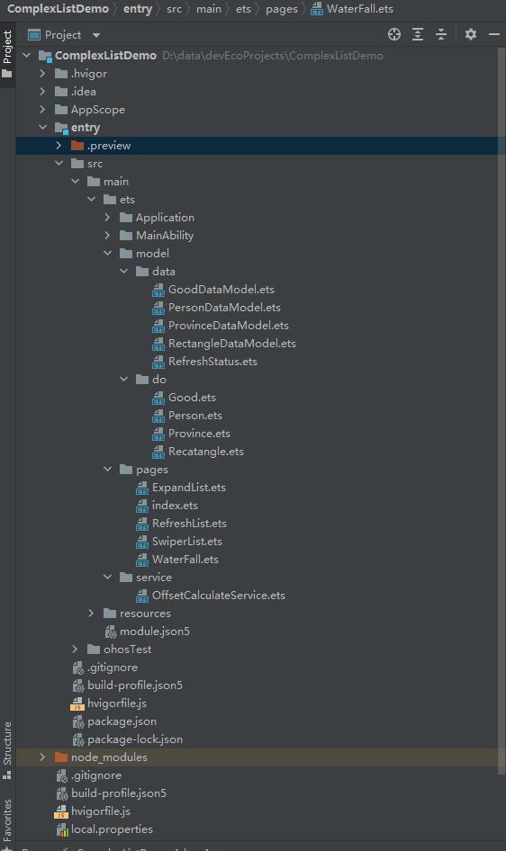
工程目录结构如下:
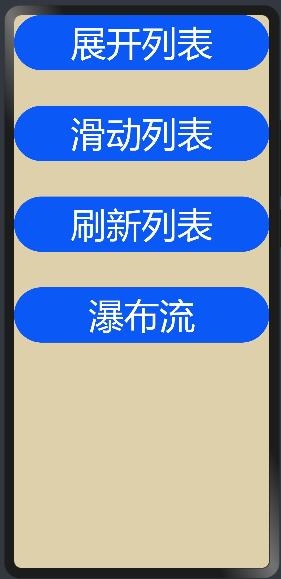
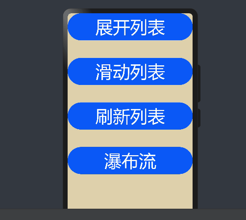
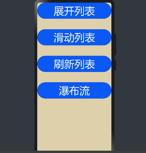
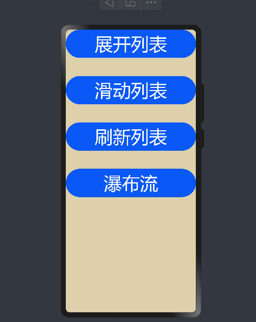
在ets/pages/目录下创建index.ets文件,为了方便进行测试,在该文件中使用Button组件搭建一个简单的入口页面。
index.ets完整代码:
import router from '@ohos.router';

@Entry
@Component
struct Index {
  build() {
    Column({ space: 50 }) {
      Button("展开列表")
        .width("100%")
        .fontSize(50)
        .height("10%")
        .onClick(() => {
          router.push({ url: "pages/ExpandList" })
        })
      Button("滑动列表")
        .width("100%")
        .fontSize(50)
        .height("10%")
        .onClick(() => {
          router.push({ url: "pages/SwiperList" })
        })
      Button("刷新列表")
        .width("100%")
        .fontSize(50)
        .height("10%")
        .onClick(() => {
          router.push({ url: "pages/RefreshList" })
        })
      Button("瀑布流")
        .width("100%")
        .fontSize(50)
        .height("10%")
        .onClick(() => {
          router.push({ url: "pages/WaterFall" })
        })
    }
    .backgroundColor("#ffddd0aa")
    .height('100%')
  }
}
效果如下:
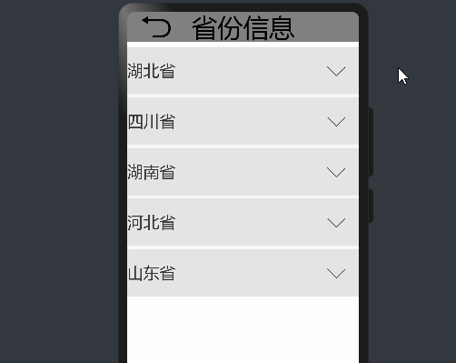
这里以显示各省份下的地级市为例。
在ets/model/do目录下创建Province.ets文件,在其中定义Province和City类分别封装省份和地级市信息。
Province.ets:
export class Province{
  id:number;
  name:string;
  cities:City[];
}

export class City{
  id:number;
  name:string;
}
在model/data目录下创建ProvinceDataModel.ets文件,定义示例中需要的测试数据。
ProvinceDataModel.ets:
import {Province} from '../do/province'


const provinces: Province[] = [
  {
    id: 0,
    name: "湖北省",
    cities: [
      { id: 0, name: "武汉" },
      { id: 1, name: "孝感" },
      { id: 2, name: "黄石" },
      { id: 3, name: "十堰" },
      { id: 4, name: "襄阳"},
      { id: 5, name: "宜昌" },
      { id: 6, name: "荆门" },
      { id: 7, name: "随州" }
    ]
  },
  {
    id: 1,
    name: "四川省",
    cities: [
        { id: 0, name: "成都" },
        { id: 1, name: "雅安" },
        { id: 2, name: "乐山" },
        { id: 3, name: "绵阳" },
        { id: 4, name: "资阳" }
    ]
  },
  {
    id: 2,
    name: "湖南省",
    cities: [
        { id: 0, name: "长沙" },
        { id: 1, name: "株洲" },
        { id: 2, name: "湘潭" },
        { id: 3, name: "岳阳" },
        { id: 4, name: "常德"},
        { id: 5, name: "张家界"},
        { id: 6, name: "衡阳" }
    ]
  },
  {
    id: 3,
    name: "河北省",
    cities: [
        { id: 0, name: "石家庄" },
        { id: 1, name: "唐山" },
        { id: 2, name: "秦皇岛"},
        { id: 3, name: "邯郸" },
        { id: 4, name: "保定" },
        { id: 5, name: "承德" }
    ]
  },
  {
    id: 4,
    name: "山东省",
    cities: [
        { id: 0, name: "济南" },
        { id: 1, name: "青岛" },
        { id: 2, name: "淄博" },
        { id: 3, name: "烟台" },
        { id: 4, name: "济宁" },
        { id: 5, name: "泰安" }
    ]
  }

]

export function initProvinceInfo(): Province[] {
  return provinces;
}
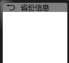
在ets/pages/目录下创建ExpandList.ets文件,在该文件中定义ExpandList组件实现列表展开收起功能。
import { Province } from '../model/do/province'
import {initProvinceInfo} from '../model/data/provincedatamodel';
...
provinces: Province[]= initProvinceInfo();
@Entry
@Component
struct ExpandList {
   ...
   ...
  build() {
    Flex({ direction: FlexDirection.Column, justifyContent: FlexAlign.SpaceBetween }) {
      Row() {
        Image($r("app.media.back"))
          .height(50)
          .width(50)
          .margin({ left: 20, right: 30 })
          .onClick(() => {
            router.back({ url: "pages/index" })
          })
        Text("省份信息")
          .fontSize(40)
          .width("100%")
          .height(50)
      }
      .width("100%")
      .height(50)
      .backgroundColor(Color.Gray)
       ...
       ...
    }
     ...
  }
}
效果如下:
@Component
struct ExpandItem {
  /**
   * 列表项展开收起的一个开关
   */
  @State
  expandStatus: boolean = false;
  province: Province;

  build() {
    Flex({ direction: FlexDirection.Column, alignItems: ItemAlign.Center, justifyContent: FlexAlign.SpaceBetween }) {
      Flex({ direction: FlexDirection.Row, alignItems: ItemAlign.Center, justifyContent: FlexAlign.SpaceBetween }) {
        Text(this.province.name)
          .width(80)
          .fontSize(25)
          .height("10%")
        if (!this.expandStatus) {
          Image($r("app.media.down_arrow"))
            .height(30)
            .width(30)
            .margin({ right: 20 })
        } else {
          Image($r("app.media.up_arrow"))
            .height(30)
            .width(30)
            .margin({ right: 20 })
        }
      }
      .onClick(() => {
        //通过改变expandStatus触发当前组件重新渲染,来控制List的收起和展开
        this.expandStatus = !this.expandStatus;
      })
      .backgroundColor("#DDDDDD")

      /**
       * 当expandStatus为true时,才绘制List组件
       */
      if (this.expandStatus) {
        List() {
          ForEach(this.province.cities, (city) => {
            ListItem() {
              Text(city.name)
                .fontSize(20)
                .width("100%")
                .height("10%")
            }
            .backgroundColor("#f86d05")
          }, (city) => city.id)
        }
        .divider({ strokeWidth: 2 })
      }
    }
  }
}
...
List({ space: 5, initialIndex: 0 }) {
        ForEach(this.provinces, (province) => {
          ListItem() {
            ExpandItem({province:province})
          }
          .opacity(0.8)
        }, (province) => province.id)
      }
...
效果如下:
这里以展示联系人列表为例。
在model/do目录下创建Person.ets文件,在其中定义Person类封装联系人相关属性。
Pserson.ets:
export class Person{
   id:number;
   name:string;
}
在同级目录下创建PersonDataModel.ets文件,定义6个联系人作为测试数据。
PersonDataModel.ets:
import {Person} from './Person'

const personArray:Person[]=[
  {id:0,name:"张三"},
  {id:1,name:"李四"},
  {id:2,name:"王五"},
  {id:3,name:"赵六"},
  {id:4,name:"钱七"},
  {id:5,name:"王八"},
]

export  function initPersonInfo():Person[]{
   return personArray;
}
在pages目录下创建SwiperList.ets文件,在该文件中定义SwiperList组件实现列表每项可滑动。
import {initPersonInfo} from '../common/PersonDataModel'
import {Person} from '../common/Person'
import router from '@ohos.router';

AppStorage.SetOrCreate("PersonList",initPersonInfo());
...
...
build() {
Flex({ direction: FlexDirection.Column }) {
Row() {
Image($r("app.media.back"))
.height(50)
.width(50)
.margin({ left: 20, right: 30 })
.onClick(() => {
router.back({ url: "pages/index" })
})
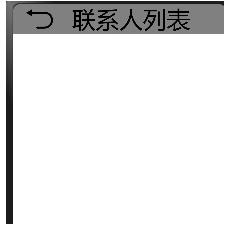
Text("联系人列表")
.fontSize(40)
.width("100%")
.height(50)
}
.width("100%")
.height(50)
.backgroundColor(Color.Gray)
...
...
}
.width("100%")
.height("100%")
}
}
效果如下:
@Component
struct SwiperItem{

  person:Person;
  scroller:Scroller=new Scroller();
  @StorageLink("PersonList")
  personList:Person[]=AppStorage.Link("PersonList");

  /*
   *置顶当前选择的联系人
   */
  setTopped(){
    let selectedIndex = this.PersonList.indexOf(this.person);
    console.info(JSON.stringify(selectedIndex));
    let tmp = this.PersonList[0];
    this.PersonList[0] = this.person;
    this.PersonList[selectedIndex] = tmp;
    this.scroller.scrollTo({ xOffset: 0, yOffset: 0 });
  }

  /**
   * 删除当前选择联系人
   *
   */
  deleteSelectedItem(){
    let selectedIndex = this.PersonList.indexOf(this.person);
    console.info(JSON.stringify(selectedIndex));
    this.PersonList.splice(selectedIndex, 1);
  }

  build(){
    Scroll(this.scroller){
      Flex({justifyContent:FlexAlign.SpaceBetween}){
        Text(this.person.name)
          .fontSize(50)
          .width("100%")
          .height("10%")
          .backgroundColor("#dddddd")
          .onClick(()=>{
            this.scroller.scrollTo({xOffset:0,yOffset:0,animation:{duration:500,curve:Curve.Ease}})
          })

        Text("置顶")
          .fontSize(50)
          .width(100)
          .height("10%")
          .backgroundColor(Color.Brown)
          .onClick(()=>{
              this.setTopped();
          })

        Text("删除")
          .width(100)
          .fontSize(50)
          .height("10%")
          .backgroundColor(Color.Blue)
        .onClick(()=>{
           this.deleteSelectedItem();
        })
      }
    }
    .width("100%")
    .scrollable(ScrollDirection.Horizontal)
    .onScroll((xOffset,yOffset)=>{
       console.info("x,y->"+JSON.stringify(xOffset+":"+yOffset));
       console.info("current scroller:"+JSON.stringify(this.scroller.currentOffset()))
    })

    .onScrollEnd(()=>{
      //滑动结束时回调,根据滑动的距离确定滚动条最终的位置。scroller.currentOffset()可以拿到滚动条相对初始位置的偏移量
      let xOffset=this.scroller.currentOffset().xOffset;
      console.info('now scroller xOffset '+JSON.stringify(xOffset))
      if(xOffset>0&&xOffset<100){
        this.scroller.scrollTo({xOffset:0,yOffset:0});
      }
      if(xOffset>100&&xOffset<200){
        this.scroller.scrollTo({xOffset:200,yOffset:0});
      }
    })
  }
}
  ...
  ...
      List(){
        ForEach(this.personList,(person)=>{
          ListItem(){
             SwiperItem({person:person})
          }
        },person=>person.id.toString())
      }
      .width("100%")
      .height("100%")
      .divider({strokeWidth:2})
   ...
   ...
效果如下:
这里以显示商品列表为例。
在model/do目录下创建Good.ets文件,在文件中定义商品类,该类包括商品的唯一id、名称、数量以及规格四个属性。
Good.ets:
export class GoodItem{
   id:number;//商品的唯一id
   name:string;//名称
   count:number;//数量
   sku:string;//规格
}
在同级目录下创建GoodDataModel.ets文件,定义12个商品数据用于测试。
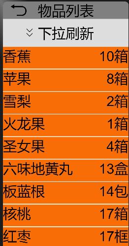
GoodDataModel.ets:
import {GoodItem} from './Good'
let goodArray:GoodItem[]=[
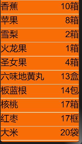
{id:0,name:"香蕉",count:10,sku:"箱"},
{id:1,name:"苹果",count:8,sku:"箱"},
{id:2,name:"雪梨",count:2,sku:"箱"},
{id:3,name:"火龙果",count:1,sku:"箱"},
{id:4,name:"圣女果",count:4,sku:"箱"},
{id:5,name:"六味地黄丸",count:13,sku:"盒"},
{id:6,name:"板蓝根",count:14,sku:"包"},
{id:7,name:"核桃",count:17,sku:"箱"},
{id:8,name:"红枣",count:17,sku:"框"},
{id:9,name:"大米",count:20,sku:"袋"},
{id:10,name:"葡萄酒",count:20,sku:"箱"},
{id:11,name:"茅台",count:32,sku:"瓶"}
];
export function initGoodsInfo():GoodItem[]{
return goodArray;
}
在model/data目录下创建RefreshStatus.ets文件,定义显示刷新状态的枚举类。
RefreshStatus.ets:
export enum RefreshStatus {
   INIT="下拉刷新",//初始状态
   READY="释放立即刷新",//准备刷新
   ON_REFRESH="正在刷新",//正在刷新
   REFRESH_SUCESS="刷新成功",//刷新成功
   REFRESH_FAIL="刷新失败",//刷新失败
   REFRESH_OVER="下拉刷新",//刷新结束

}
在ets/pages/目录下创建RefreshList.ets文件,在该文件中定义RefreshList组件实现列表下拉刷新。
build() {
Flex({ direction: FlexDirection.Column }) {
/**
* 标题栏
*/
Row() {
Image($r("app.media.back"))//返回图标
.height(50)
.width(50)
.margin({ left: 20, right: 30 })
.onClick(() => {
router.back({ url: "pages/index" })
})
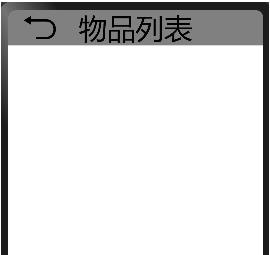
Text("物品列表")
.fontSize(40)
.width("100%")
.height("100%")
}
.width("100%")
.height(50)
.backgroundColor(Color.Gray)
...
...
}
效果如下:
  Row() {
          if (!this.isOnFresh) {
            Image(this.yOffset > 0 ? $r("app.media.up_arrow1") : $r("app.media.down_arrow1"))
              .width(50)
              .height(50)
              .margin({ left: 50 })
          } else {
            Image($r("app.media.loading"))
              .width(50)
              .height(50)
              .aspectRatio(1)
              .margin({ left: 50 })
              .rotate({
                x: 0,
                y: 0,
                z: 1,
                angle: this.rotateAngle,
                centerX: 75,
                centerY: 25
              })
          }
          Text(this.refreshContext)
            .fontSize(40)
            .height(80)
            .margin({ right: 40 })
        }
        .width("100%")
        .backgroundColor("#dddddd")
效果如下:

List({ scroller: this.scroller }) {
          ForEach(this.goods, (good) => {
            ListItem() {
              Flex({ justifyContent: FlexAlign.SpaceBetween }) {
                Text(good.name)
                  .fontSize(40)
                  .height("8%")
                Text(`${good.count}${good.sku}`)
                  .fontSize(40)
                  .height("8%")
                  .margin({ right: 2 })
              }.width("100%")
            }
            .backgroundColor("#f86d05")
          }, (good) => good.id)
        }
效果如下:
效果如下:
...
...
@Entry
@Component
struct RefreshList {
  ...
  build() {
    Flex({ direction: FlexDirection.Column }) {
      ...
      Column() {
        ...
        List({ scroller: this.scroller }) {
          ...
        }
        .edgeEffect(EdgeEffect.None) //默认为Spring
        .width("100%")
        .divider({ strokeWidth: 2 })
        .onTouch((event: TouchEvent) => {
          console.info(JSON.stringify(event.touches[0]))
          switch (event.type) {
            case TouchType.Down:
              this.firstPress = event.touches[0].y; //记录手指首次按下时的位置
              console.info("first Prsss location:" + this.firstPress);
              break;
            case TouchType.Move:
              this.lastUp = event.touches[0].y; //记录手指沿着屏幕下滑每一时刻的位置
              this.yOffset = this.lastUp - this.firstPress; //计算手指下滑的距离,也就是列表下拉的距离,并更新UI,使得列表开始向下移动,即列表会随着手指的滑动而移动
              console.info(`yOffset value:${this.yOffset}`)
              if (this.yOffset >= this.criticalDistance) {
                this.refreshContext = RefreshStatus.READY; //当下拉距离超过临界值,将刷新状态更新为"释放立即刷新",触发页面重新渲染
              } else {
                this.refreshContext = RefreshStatus.INIT; //这里有两种情况:一是下拉距离尚未超过临界值,二是已超过临界值但是又向上滑回去使得列表最终的位置还是未达到临界位置,这两种情况都不能开始刷新
              }
              if (this.yOffset < 0) {
                this.yOffset = 0;
              }
              break;
            case TouchType.Up:
              this.lastUp = event.touches[0].y; //记录手指抬起时的位置
              console.info("last up location:" + this.lastUp);
              let dis = this.lastUp - this.firstPress; //计算手指抬起时的位置和首次按下时的位置之间的距离
              console.info(`move distance:${dis}`)
              if (dis < this.criticalDistance) {
                this.yOffset = 0; //手指抬起时的下拉距离尚未超过临界值,列表返回初始位置
              } else {
                this.isOnFresh = true; //将图标更新为正在刷新状态
                this.refreshContext = RefreshStatus.ON_REFRESH; //将刷新状态更改为正在刷新
                this.refreshList(); //开始刷新列表
              }
              break;
            default:
              break;
          }
        })
      }
      .position({ x: 0, y: 50 + this.yOffset })
      .width("100%")
      .height("100%")
    }
    .width("100%")
    .height("100%")
  }
}
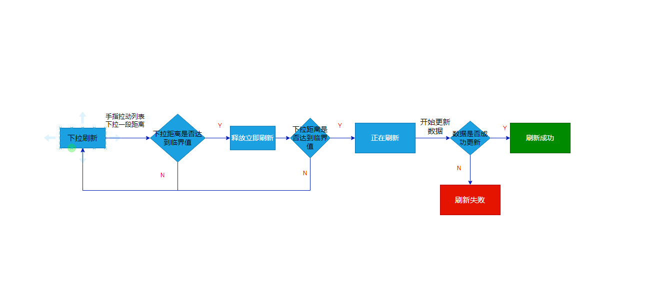
刷新状态流程图如下:
最终效果如下:
在model/do目录下创建Rectangle.ets文件,在该文件中定义瀑布流中需要显示的元素的数据结构。
Rectangle.ets:
export class Rectangle{
    id:number;//矩形元素唯一id
    width:number;//矩形宽度
    height:number;//矩形高度
    color:string;//矩形背景颜色
    offset:number;//矩形在纵轴方向上相对于初始位置的偏移量
}
在model/data目录下创建RectangleDataModel.ets文件,定义一定数量的Rectangle对象作为测试数据。
import {Rectangle} from '../do/recatangle'

const rects:Rectangle[]=[];
const colors= ["#f86d05", "#cce4e4e4", "#fa2a2d", "#ff4fe363", "#cce4e4e4", "#C8303118","#419fff", "#fb4447", "#3f97e9"]
for(let i=0;i<28;i++){
   let rect:Rectangle= new Rectangle();
   rect.id=i;
   rect.width=25;
   rect.height=50+Number(100*Math.random());//每个矩形元素的高度在50~150之间随机取值
   rect.color=colors[i%colors.length];
   rect.offset=0;
   rects.push(rect);
}

export function getRectanglesInfo():Rectangle[]{
     return rects;
}
在service目录下创建OffsetCalculteService.ets文件,在该文件中定义OffsetCalculateService类用于计算每一个矩形元素在布局时纵轴方向上的偏移量。
OffsetCalculteService.ets:
import {Rectangle} from '../model/do/recatangle'
export class OffsetCalculateService{
/**
* 每一行元素个数
*/
private perRowCount:number=4;
setPerRowCount(perRowCount:number){
this.perRowCount=perRowCount;
}
/**
* 计算每一个矩形框在布局时Y轴方向的偏移量
* @param candidateRectangles
*/
public calculateOffset(candidateRectangles:Rectangle[]){
let preRectHeights:number[]=this.initPreRectHeight(candidateRectangles,this.perRowCount);
this.doCalculateOffset(candidateRectangles,preRectHeights);
}
private initPreRectHeight(candidateRectangles:Rectangle[],rowCount:number){
let preRectHeights:number[]=[];
for(let i=0;i<rowCount;i++){
preRectHeights.push(candidateRectangles[i].height);
}
console.info("init arr: "+JSON.stringify(preRectHeights))
return preRectHeights;
}
/**
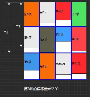
* 每个矩形元素的偏移量=矩形元素所在行前面的所有行的元素的最大高度之和-与当前元素在同一列的前面所有行元素的高度之和
* @param candidateRectangles
* @param preRectHeights
*/
private doCalculateOffset(candidateRectangles:Rectangle[],preRectHeights:number[]){
let maxHeight=Math.max(...preRectHeights);//代表了当前行前面的每一行元素的最大高度之和,这里先赋值第一行元素的最大高度
console.info("init max height:"+JSON.stringify(maxHeight));
let len:number=preRectHeights.length;
let tmp:number[]=[]; //临时数组,用来计算当前行所有元素的最大高度,Math.max(...tmp)
for(let i=len;i<candidateRectangles.length;i++){
let preHeight:number=preRectHeights[i%len];//代表与当前元素在同一列的前面所有行元素的高度之和
let curHeight:number=candidateRectangles[i].height;//当前元素的高度
console.info("pre height:"+JSON.stringify(preHeight)+",cur height:"+JSON.stringify(curHeight))
candidateRectangles[i].offset=-( maxHeight-preHeight);//“-”号表示是向上的偏移量
preRectHeights[i%len]=preHeight+curHeight;//把当前元素的高度和与当前元素在同一列的前面所有行元素的高度之和合并
tmp.push(curHeight);
if(i%len==(len-1)&&i>len){//每排完一行计算当前行最大高度,并和前面所有行的最大高度合并
maxHeight+=Math.max(...tmp);
tmp.splice(0,len);//
}
console.info("current max height:"+maxHeight)
}
}
}
偏移量计算方式如图:
在pages/目录下创建WaterFall.ets文件。在该文件中导入Rectangle类、OffsetCalculateService类和getRectanglesInfo方法
@Component
struct  VerticalLayout{
  rectArray: Rectangle[]= getRectanglesInfo();

  build() {
    Flex({ direction: FlexDirection.Column, wrap: FlexWrap.Wrap, alignContent: FlexAlign.Start }) {
      ForEach(this.rectArray, (rect) => {
        Row() {
          Text(`第${rect.id.toString()}项`)
            .fontSize(16)
            .align(Alignment.Center)
            .width("100%")
            .height(rect.height)
            .backgroundColor(rect.color)
            .border({ width: 1 })
            .margin(1)
        }
        .width(`${rect.width}%`)
        .height(rect.height)
      }, (rect) => rect.id.toString())
    }
    .width("100%")
    .height(750)
  }
...
}
@Component
struct HorizontalLayout{

  rectArray: Rectangle[]= getRectanglesInfo();

  build() {
    Flex({ direction: FlexDirection.Row, wrap: FlexWrap.Wrap, alignContent: FlexAlign.Start }) {
      ForEach(this.rectArray, (rect) => {
        Column() {
          Text(`第${rect.id}项`)
            .fontSize(16)
            .align(Alignment.Center)
            .width("100%")
            .height(rect.height)
            .backgroundColor(rect.color)
            .border({ width: 1 })
        }
        .width(`${rect.width}%`)
        .offset({ x: 0, y: rect.offset })
      }, rect => rect.id)

    }
    .width("100%")
    .height(750)
  }

  aboutToAppear() {
    let calculator: OffsetCalculateService = new OffsetCalculateService();
    calculator.calculateOffset(this.rectArray);
    console.info(JSON.stringify(this.rectArray))
  }
}
@Entry
@Component
struct WaterFall {
  @State
  isVerticalLayout: boolean = false; //瀑布流中元素排列方式,true代表纵向,false代表横向

  build() {
    Column() {
      Row() {
        Image($r("app.media.back"))
          .height(50)
          .width(50)
          .margin({ left: 20, right: 30 })
          .onClick(() => {
            router.back({ url: "pages/index" })
          })
        Text("瀑布流")
          .fontSize(40)
          .width("100%")
          .height(50)
      }
      .width("100%")
      .height(50)
      .backgroundColor(Color.Gray)

      Stack({ alignContent: Alignment.Bottom }) {
        if (this. isVerticalLayout) {
          VerticalLayout()
        } else {
          HorizontalLayout()
        }
        Row() {
          Text("切换排列方式")
            .margin({ left: 20, bottom: 20, right: 30 })
            .align(Alignment.Center)
            .fontSize(40)
            .width("100%")
            .height("100%")
            .onClick(() => {
              this.isVerticalLayout = !this.isVerticalLayout;
            })
        }
        .width("100%")
        .height("10%")
        .backgroundColor(Color.Brown)
      }

    }
    .width("100%")
    .height("100%")
  }
}
效果如下:
[1] 使用ArkTS语言开发(Stage模型). https://gitee.com/openharmony/docs/blob/master/zh-cn/application-dev/quick-start/start-with-ets-stage.md
[2]List组件介绍. https://gitee.com/openharmony/docs/blob/master/zh-cn/application-dev/reference/arkui-ts/ts-container-list.md
[3] Grid组件介绍. https://gitee.com/openharmony/docs/blob/master/zh-cn/application-dev/reference/arkui-ts/ts-container-grid.md
[4] Scroll组件介绍. https://gitee.com/openharmony/docs/blob/master/zh-cn/application-dev/reference/arkui-ts/ts-container-scroll.md