2301-MUSE

OutOfTheOrdinary:Prototype design
 墨衍会员 · AI 创作全网分发 墨衍智能分发 通过墨衍一键同步至各平台 可同步平台 CSDN微信公众号微博知乎掘金百家号博客园抖音小红书 你的文章也可以这样分发 墨衍会员 ¥399起/年,写一次发全网
我也要 关注 + 加入社区
墨衍会员 · AI 创作全网分发 墨衍智能分发 通过墨衍一键同步至各平台 可同步平台 CSDN微信公众号微博知乎掘金百家号博客园抖音小红书 你的文章也可以这样分发 墨衍会员 ¥399起/年,写一次发全网
我也要 关注 + 加入社区| The course of assignment5 | https://bbs.csdn.net/forums/ssynkqtd-04 |
|---|---|
| Requirement of this assignment | https://bbs.csdn.net/topics/617468304 |
| Team name | Out of the ordinary |
| The goal of this assignment | Complete the basic ui design of conference application. |
| Other reference materials | no reference |
| Prototype web page link | prototype link |
CONTENT
- 1. Project Division of Labor
- 1.1 Specific division of labor
- 2. Prototype interface design
- 2.1 prototype development tool
- 2.2 Process and results of prototype design
- 3. Results Reporting
- 3.1 Introduce your prototype
- 3.2 Difficulties encountered and solutions
- 3.3 Results show
- 4. Team feeling
- 4.1 Work photos of relevant personnel
- 4.2 Interpersonal evaluation
1. Project Division of Labor
| Student ID | Work Description | Contribution |
|---|---|---|
| 832102226 | Prototype interface design | 38.7% |
| 832102230 | Prototype interface design | 38.7% |
| 832002226 | Prototype interface design | 12.6% |
| 832102225 | Ddfense ppt writing | 5% |
| 832102224 | Blog writing | 5% |
1.1 Specific division of labor
| Student ID | Work Description |
|---|---|
| 832102226 | Overall UI design planning and task assignment, UI interface design and interaction of login, notification and team, overall prototype interaction design, UI file export, demonstration video recording and document writing. |
| 832102230 | UI interface design of home page, calendar and face recognition, prototype interaction design of corresponding modules, prototype interaction test and modification, web page test and document writing. |
| 832002226 | Export of some files, file management and document writing. |
2. Prototype interface design
2.1 prototype development tool
We mainly use JS Design as the leading prototype interface design, and Adobe XD and Photoshop as auxiliary tools to design interfaces and widgets, citing some icons in Alibaba vector library.
JS design is a domestic professional UI design tool that can be edited in the cloud. It is supported by single visual design, merger prototype framework design, component library support, online design and teamwork.
JS design has the following advantages for our team:
● Ease of use: The operation of JS Design is simple, and even users who have no design foundation can get started quickly.
● Collaboration: JS Design supports multi-person collaborative design, which can improve design efficiency.
● Extensibility: JS Design supports third-party plug-ins, which can meet the individual needs of users.
● Design material library: The design material library of JS Design contains a large number of high-quality graphics, icons, fonts, colors, etc., which can meet the different design needs of users.
● Developer mode: JS Design has a developer developer mode, which can facilitate the docking between our UI group and the front-end group. The cutting, color information and labeling that developers need most are also gathered on the far right side of the panel. Developers can freely switch between iOS, Web and Android development platforms. Support for page elements, export pictures in various formats and magnification.
● Compatibility: js Design supports the import and direct editing of XD, Figma, Sketch and JS files, and resources with different file formats can be used, which greatly improves the efficiency of our UI design and builds a bridge for resource interoperability.

2.2 Process and results of prototype design
- Demand research
Before the prototype design, our team discussed and clarified the functions of the system and the user's needs, and understood the user's usage scenarios, goals and expectations. The advantages and disadvantages of related competing products (Teams, FUUU, etc.) are analyzed to learn from each other's strengths. - Information architecture design
Our team classifies and arranges the information to form an information structure, and layers the information according to its importance and relevance to determine the logical relationship between the information. At the bottom of the interface, there are five sections: home page, calendar, team, notice and personal center, which make navigation faster and faster. - Visual design
First, the interface design. On the basis of demand analysis, our team began to use JSdesign to design the structure and layout of the interface, plan the overall architecture of the system, and the classification and navigation path between various functions. Our team's design style is simple and clear, so as to quickly find the corresponding functions and operate them. The colors are mainly gray, white and blue, and the background adopts light purple tone gradient, which highlights simplicity but not monotony.

On the basis of interface design, our team designed the components of each functional module. Buttons, text boxes, fonts, scrolling menus, lists, etc. And design according to user needs and interface style. Combine users' habits and expectations to provide a good user experience. Team members discuss with each other and constantly optimize and adjust the design scheme until satisfactory results are achieved.
4. Interaction design
After the interface and components were completed, our team began to design the interaction. Include interactive elements, interactive actions, interactive feedback, etc. Make it easy for users to use the interface to accomplish their goals. We use the interactive prototype tool to simulate the interaction process between users and the system many times, and add some scrolling and switching interactions to further improve the interactive experience.
5. test feedback
After the design is completed, we invited some users to test and collect their feedback and opinions to ensure that the design meets the needs of users, is easy to use and meets the standards. Testing includes functional testing, user experience testing and usability testing. According to the feedback from users, our team improved and optimized the interaction design to improve the user experience.
- After the above process, we designed a prototype whose interface meets the requirements. It can meet the needs and expectations of users, provide the functions and information needed by users, and present it intuitively on the user interface. Our team organized and classified information and functions reasonably, and provided clear navigation labels for users to operate conveniently. In terms of interaction, it can provide a simple, intuitive and natural way of interaction and reduce the learning cost of users. Users can easily complete the operation and get the expected results when interacting with the prototype.
3. Results Reporting
3.1 Introduce your prototype
- In this project, we carefully understand the needs of product managers and communicate with them in time. Based on real-time design, this efficient and convenient UI design software is designed, and after mastering the basic techniques of UI drawing and interactive design, the UI page is designed in a simple style, aiming at easy use and complete functions. At the bottom of the software, the functions of the software are divided into five sections, namely, activities, calendar, home page, team and mine, in which the main function of the "My" page is to view notifications and private messages; The main function of the Calendar page is to view the itinerary list and create new itineraries; The main function of the "Home Page" page is to search the existing itinerary and join it, and at the same time view the current itinerary and check in for face recognition; The Team page is mainly used to create new teams and view my teams; On the "My" page, some users' personal information (such as name, ID and so on) will be displayed.
- At the top of the homepage, the words "Home Page" are on the left, and the search box is on the right. Click here to search the itinerary and join; In the main part of the page, users can see the real-time time time, which is convenient for users to check whether the trip is about to start; Go down and show what the trips are for that day, and click the "roll call" button for each trip to jump to the page of uploading pictures for identification.
Check in.

- At the top of the calendar, the word "Calendar" is on the left, and there are two buttons on the right. The buttons on the left are trip list and on the right.
- The button is to create a trip. Click the buttons on both sides to switch functions. When the user enters the calendar interface, the trip column will be displayed by default.
- Table, a calendar will appear in the itinerary list, and users can switch dates to view itineraries on different dates.

- At the top of the team interface, there is the word "Team" on the left and the button to search and create a team on the right, which users can use. Realize the corresponding function and show the user's team in the main body of the page.

- At the top of the notification page, the words "message" are on the left, and the buttons for searching and setting are on the right. Users can click them to realize corresponding functions. In the theme part of the page, chat records and notifications related to users will be displayed on the page, and users can click them to enter the chat page for communication, as shown in the following figure:

- In the personal center interface, the user's name and account information will be displayed, and at the same time, users can modify their personal information on this interface: personal data, face binding, suggestions and feedback, historical data and logout.

3.2 Difficulties encountered and solutions
In the process of this UI design, while gaining the corresponding UI design experience and technology, we also encountered some difficult problems, as follows:
(1) Question 1: I can't understand the needs of the product department for the first time. When our UI team got the relevant requirements of the product department for the first time, due to the lack of experience and the lack of further careful reading of the requirements documents, when designing some pages with complex functions (such as calendars) at first, the designed pages were different from the requirements given by the product department, so they were revised again after learning the correct requirements, which wasted unnecessary working time.
Solution: When we found that the first draft of the UI interface was inconsistent with the original requirements, we stopped the current design process in time and carefully read the product requirements document again, rearranged the design ideas and made a draft with the sketchpad before modifying the interface, and finally successfully modified the interface, and we learned the experience of full communication before designing.
(2) Question 2: It is difficult to achieve the effect of time scrolling in the UI for the first time. When we design the interface of setting time in the calendar part, after clicking the "Select" button, we will jump out of the pop-up box and slide the page to select the time. The scrolling effect here doesn't know how to time at first.
Solution: After understanding the source of the difficulties, we consulted a lot of tutorials about UI design on the Internet, and learned and referred to how other people's excellent UI design was made. Finally, we learned that we must add a drawing board outside our original interface to realize local display, and then select our original page on the prototype page of the editor, add the effect of "overflow scrolling", and select "beyond the drawing board to hide" to realize the scrolling effect.
3.3 Results show


4. Team feeling
4.1 Work photos of relevant personnel
Ui designers are all working hard.
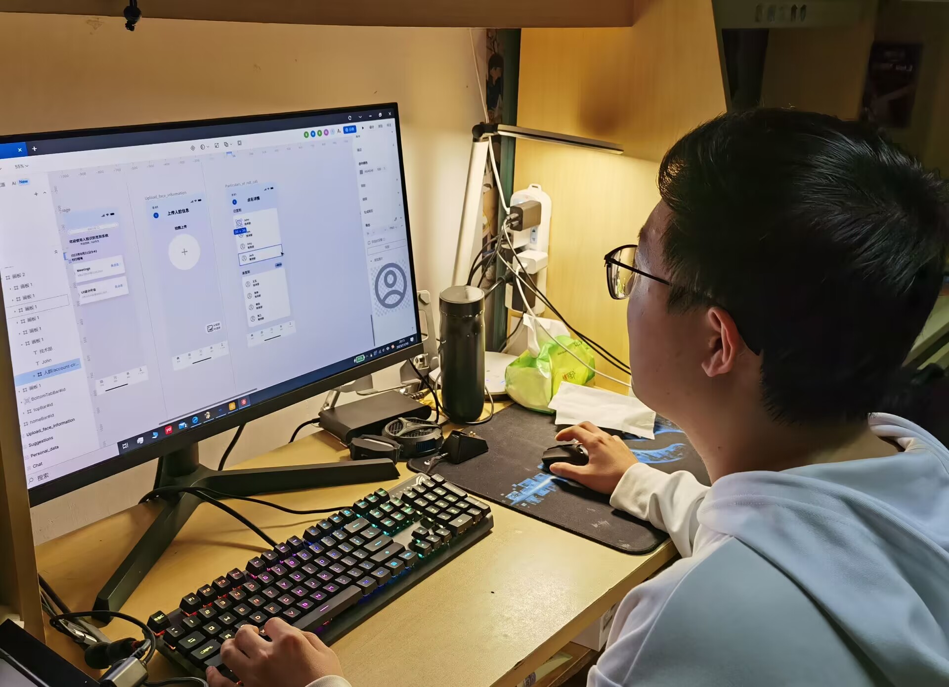 图1 图1 | 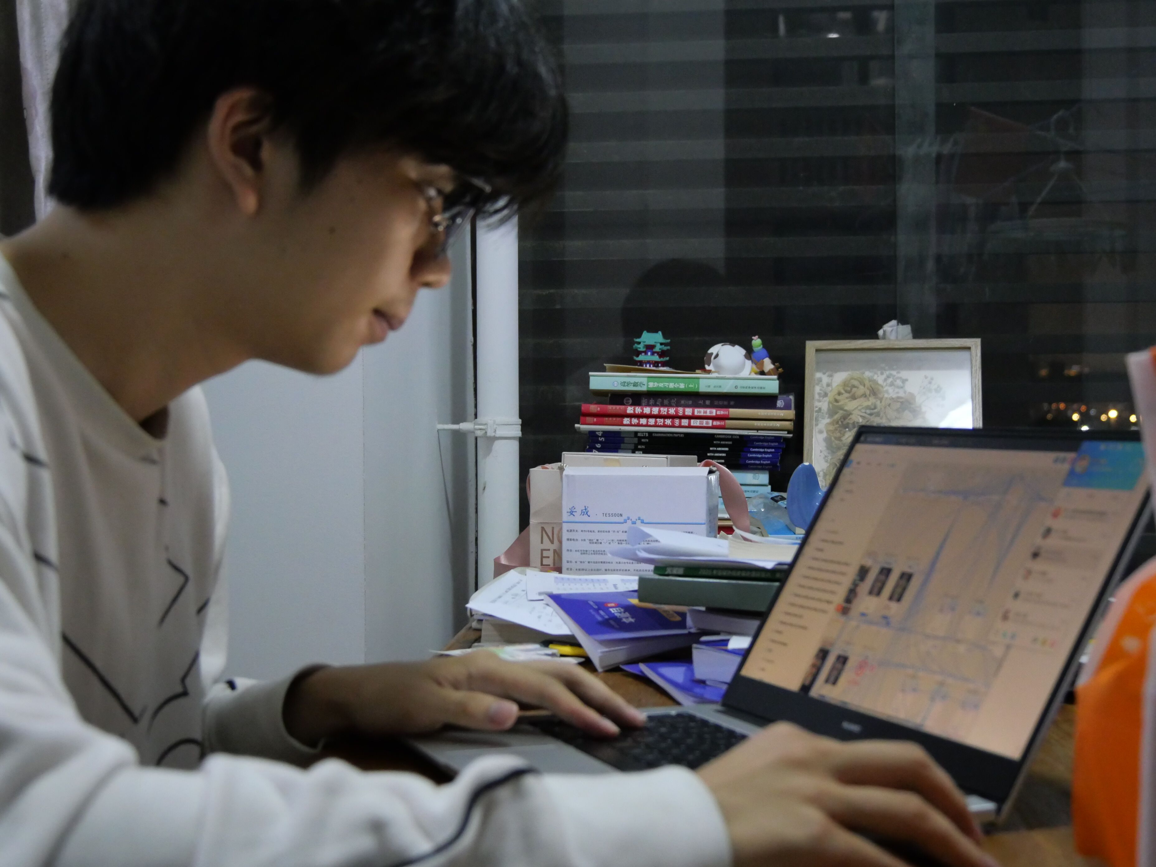 图2 图2 | 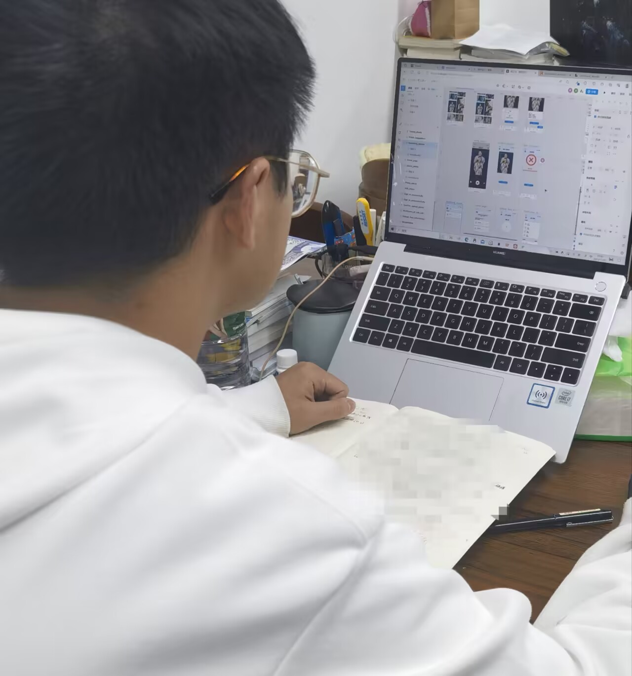 图3 图3 |
4.2 Interpersonal evaluation
- Team leader's comments: ui designers work very efficiently, and their designs are not made at once. They have made a version from the beginning of the project, but it is not very good. They have made several versions. They are really striving for perfection and have patience.
- The cooperative atmosphere of the team is very harmonious, and everyone actively participates and supports and encourages each other. Everyone pursues excellent design together and always maintains a high degree of work enthusiasm. In the team, members often discuss and share the design. Everyone has the opportunity to show their design works and get valuable opinions and suggestions from other members. This not only helps us to constantly improve our design skills, but also promotes knowledge exchange and learning among teams. The division of labor and cooperation of the team is also very smooth. We define everyone's responsibilities and tasks, and communicate and coordinate in time. Everyone is very focused on their own work, but they also actively cooperate with the needs of other members. This efficient cooperation enables us to finish the project on time and ensure the quality and effect of the design. Generally speaking, the atmosphere of teamwork is good, and everyone is actively involved, learning and communicating with each other, which has benefited a lot.
- Before the UI design, our team assigned tasks, determined the learning course of UI design, discussed and learned from each other in the process of UI design, and found relevant materials together to solve the problems that could not be solved.
- My teammates have the following advantages:
- Have strong design skills, be able to skillfully use various design tools, have a solid grasp of design theory and knowledge, and be able to design interfaces that meet users' needs according to different design requirements.
- Strong design style, concise design style, strong visual impact, and can leave a good impression on users.
- Proactive working attitude, strong sense of responsibility, ability to complete design tasks independently, effective cooperation with team members, and timely feedback of opinions and suggestions.
相关推荐
硕士复现燃料电池供氢系统建模及控制策略Simulink仿真(附带说明PPT+参考文献+复现模型+实物源码)
内容概要:本资源聚焦于燃料电池供氢系统的建模与控制策略研究,通过Simulink仿真平台实现系统动态行为的精确模拟与控制算法的验证。内容涵盖供氢系统的关键部件建模,如氢气供应管路、压力调节阀、储氢罐及燃料电池堆等,并针对系统响应滞后、压力波动等问题,设计并实现了先进的控制策略,例如基于反馈与前馈的复合控制、PID控制或模型预测控制(MPC),以确保氢气供给的稳定性与效率。配套提供的说明PPT详细阐述了建模思路与控制逻辑,参考文献为研究提供了理论支撑,而完整的复现模型与实物源码则极大地方便了学习者进行仿真复现与二次开发。; 适合人群:具备一定自动化、电气工程或能源动力系统背景,正在进行相关课题研究的研究生,以及从事氢能系统开发的工程技术人员。; 使用场景及目标:① 学习并掌握燃料电池供氢系统的工作原理与关键组件的数学建模方法;② 利用Simulink搭建复杂能源系统的仿真模型,并设计、调试与验证先进控制策略;③ 基于提供的完整资源包(PPT、模型、源码)进行科研复现,作为学位论文或学术研究的技术基础。; 阅读建议:学习者应结合说明PPT的理论讲解,逐步操作复现模型,重点关注控制模块的设计逻辑与参数整定过程。建议在理解现有模型的基础上,尝试修改工况参数或优化控制算法,以深化对系统动态特性的认识,从而将本资源作为开展自主创新研究的有效跳板。
风光火储多源协同参与电网一次调频与二次 AGC 调频控制策略研究(Simulink仿真实现)
内容概要:本文研究了风光火储多源协同参与电网一次调频与二次AGC调频的控制策略,并通过Simulink进行仿真实现。深入分析了风能、光伏、火电及储能系统在电网频率调节中的出力特性与动态响应机制,提出了一种综合协调控制策略,实现调频责任的合理分配与控制指令的有效分解。研究涵盖了多能源系统建模、频率偏差检测、调频功率分配逻辑、控制器参数设计及闭环仿真验证等关键环节,有效提升了高比例新能源接入背景下电力系统的频率稳定性与抗扰动能力。; 适合人群:具备电力系统、自动化或新能源相关背景,从事电网控制、能源调度、仿真建模等工作的科研人员与工程技术人员,尤其适合研究生及从事新能源并网与电力系统稳定研究的专业人员。; 使用场景及目标:①应用于高比例新能源接入电网的频率稳定控制研究;②为风光火储多能互补系统的协同控制策略设计提供仿真验证平台;③支持电力系统仿真教学与科研中的动态性能分析与控制算法开发。; 阅读建议:建议结合Simulink模型文件同步运行仿真,深入理解各模块控制逻辑;重点关注多源调频的协调机制与参数整定方法,可进一步扩展至含储能优化配置或考虑通信延迟的场景研究。
毕业设计含文档和代码VB+ACCESS汽车租凭管理系统(论文+系统)
毕业设计含文档和代码VB+ACCESS汽车租凭管理系统(论文+系统)
LangGraph图版本控制:迁移与兼容性处理
内容概要:讲解随着需求变化,LangGraph图结构如何演进。展示状态字段增删改、节点重命名、边调整时的兼容策略。通过版本号字段和迁移函数示例,说明如何处理旧检查点数据。讨论灰度发布和A/B测试中的多图版本并存方案。 sjbzhibo.hqjxgs.com hntxmedia.com www.honglu-cy.com seriea-live-streaming.hnxskj.com cbalive.htne.com.cn
Delphi 13.2控件之DBX-0.6.26-x64-setup.exe.7z
Delphi 13.2控件之DBX_0.6.26_x64-setup.exe.7z