


1,040
社区成员
 发帖
发帖 与我相关
与我相关 我的任务
我的任务
 分享
分享这是我参加朝闻道知识分享大赛的第12篇文章。
注:CSS面试题分享板块的内容均为常见的前端面试中会涉及的知识点。
具体的问题内容大同小异,大家遇到时具体问题具体分析即可。
前言:本文将会给大家介绍在CSS中实现动画的三种主要方法,帮助你更好的在CSS中使用动画。
目录
CSS动画(CSS Animations)是为层叠样式表建议的允许可扩展标记语言(XML)元素使用CSS的动画的模块 即指元素从一种样式逐渐过渡为另一种样式的过程
简单动画:平移、旋转、缩放 复杂动画:由多个CSS的简单动画组合实现
参考文档-transition(property,duration,timing-function,delay)
transition为简写属性,可以通过transition-*分别设置
property:指定css属性(写属性名字即可,不用加双引号)
duration:动画时间(单位为s或者ms)
timing-function:动画速度曲线
delay:延迟时间(单位为s或者ms)
timing-function值:
| 值 | 描述 |
|---|---|
| linear | 匀速-cubic-bezier(0,0,1,1) |
| ease | 慢-快-慢-cubic-bezier(0.25,0.1,0.25,1)(默认) |
| ease-in | 渐快-cubic-bezier(0.42,0,1,1) |
| ease-out | 渐慢-cubic-bezier(0,0,0.58,1) |
| ease-in-out | 先快后慢-cubic-bezier(0.42,0,0.58,1) |
| cubic-bezier(P0,P1,P2,P3) | 用cubic-bezier定义三次贝塞尔曲线作为动画的速度曲线 |
注意:如display这类的属性就不能使用过渡动画
示例代码:

<style>
  .base {
    width: 100px;
    height: 100px;
    display: inline-block;
    background-color: #0ea9ff;
    border-width: 5px;
    border-style: solid;
    border-color: #5daf34;
    transition-property: width, height, background-color, border-width;
    transition-duration: 2s;
    transition-timing-function: ease-in;
    transition-delay: 500ms;
  }
  .base:hover {
    width: 200px;
    height: 200px;
    background-color: #5daf34;
    border-width: 10px;
    border-color: #3a8ee6;
  }
</style>
<div class="base"></div>
参考文档-transform(translate(x,y,z) scale(x,y,z) rotate(deg) skew(deg))
translate:位移,参数为位移的大小(写一个为x)
scale:缩放,参数为放大的倍数(写一个为x、y)
rotate:旋转,参数为旋转的角度
skew:倾斜,参数为倾斜的角度
注意:多个功能间用空格分隔,用逗号会失效。
注意:transform不支持inline元素,需要提前转换为block。
示例代码:
transform自己使用是没有动画效果的,可以配合transition实现动画效果

<style>
  .base {
    width: 100px;
    height: 100px;
    display: inline-block;
    background-color: #0ea9ff;
    border-width: 5px;
    border-style: solid;
    border-color: #5daf34;
    transition-property: width, height, background-color, border-width;
    transition-duration: 2s;
    transition-timing-function: ease-in;
    transition-delay: 500ms;
  }
  .base {
    transform: none;
    transition-property: transform;
    transition-delay: 5ms;
  }
  .base:hover {
    transform: scale(0.8, 1.5) rotate(35deg) skew(5deg) translate(15px, 25px);
  }
</style>
<div class="base"></div>
参考文档-animation
animation为简写属性,可以通过animation-*分别设置
| 属性 | 描述 | 属性值 |
|---|---|---|
| name | 指定@keyframes定义的动画的名称 | |
| duration | 指定动画的持续时间 | 默认:0,单位:s/ms |
| timing-function | 指定动画的速度曲线 | 默认:ease |
| delay | 指定动画的延迟时间 | 默认:0,单位:s/ms |
| iteration-count | 指定动画的播放次数 | 默认:1 infinite-循环播放 |
| direction | 指定动画的方向 | normal-正常方向 reverse-反方向 alternate-正反交替 alternative-reverse-反正交替 |
| fill-mode | 指定动画的填充模式 | none-不设置状态 forwards-结束时的状态 backwards-开始时的状态 both-开始或结束时的状态 |
| play-state | 指定动画的播放状态 | running-运动 paused-暂停 |
示例代码:
我们通过@keyframes定义关键帧,其他帧浏览器根据计时函数差值计算
<style>
/* 通过from设置最开始的帧,通过to设置结束时的帧 */
@keyframes rotate1 {
from {
transform: rotate(0deg);
}
to {
transform: rotate(360deg);
}
}
/* 可以通过百分比刻画生命周期来实现更加自定义的效果 */
@keyframes rotate2 {
0% {
transform: rotate(0deg);
}
50% {
transform: rotate(180deg);
}
100% {
transform: rotate(360deg);
}
}
.base {
width: 500px;
height: 500px;
background-color: burlywood;
}
.base:hover {
animation: rotate1 8s;
}
</style>
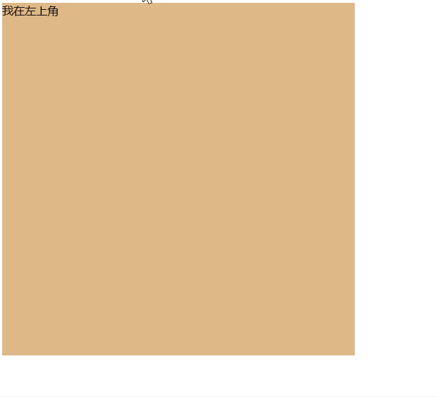
<div class="base">我在左上角</div>
| 属性 | 含义 |
|---|---|
| 过渡-transition | 用于设置元素的样式的过度,效果类似animation |
| 转换-transform | 用于元素进行位移、缩放、旋转、倾斜,本身与动画无关 |
| 自定义-animation | 用于自定义设置动画效果 |


