Team Geeks - Beta Sprint log 2

Team_Geeks 团队账号 2023-12-13 20:18:13

I. SCRUM

Achievements from yesterday’s stand-up meeting to the present

  • 周玥:

    Update:

    • SCSS Mixin for Button Colors: The page includes a SCSS mixin named 
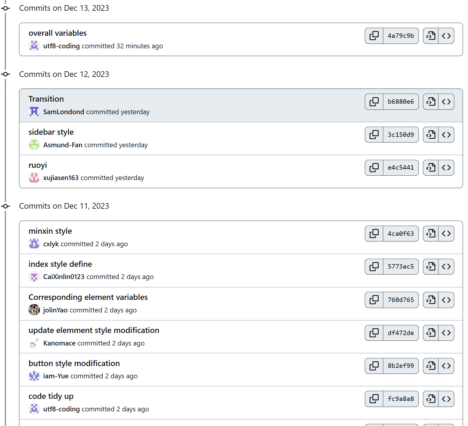
colorBtn which applies a background color to buttons and changes the color on hover.
    • Button Classes: There are several button classes defined such as .blue-btn, .light-blue-btn, .red-btn, etc., each including the colorBtn mixin with different color variables.
    • Pan Button Style: The .pan-btn class has additional styles for font size, padding, border-radius, and hover effects with before and after pseudo-elements.
    • Custom Button: A .custom-button class is also defined for a generic button style with properties like line-height, background, color, and border-radius.
  • 黄家成

    My changes include style overrides for Element UI components .el-breadcrumb__inner, .el-upload, .cell, .small-padding, .fixed-width, .status-col, .el-dialog, .upload-container, .el-dropdown-menu, .el-range-editor.el-input__inner, and .el-menu--collapse. Specific modifications include font weight adjustments, display property changes, padding, width, and text alignment tweaks, as well as fixes for known issues with Element UI components.

  • 姚依林

    Update:

    • Theme Customization: The file contains customizations for the default theme color of the Element UI library, suggesting the original colors were considered too light for long-term use.
    • Color Variables: New color variables are defined for primary, success, warning, and danger themes, as well as other UI elements like buttons and borders.
    • Sass & Webpack Integration: The :export directive is used, indicating an integration between Sass and Webpack to share variables between JavaScript and Sass.
  • 蔡心林

    Update:

    • The .app-container class sets the width and margin of the main container element, as well as the background color and box-shadow properties.
    • The .pagination-container class applies flexbox properties to align and justify the pagination elements, as well as adding some padding and margin.
    • The .sub-navbar class styles the secondary navigation bar with a fixed position, a gradient background, and a box-shadow effect. It also uses a media query to adjust the display property for smaller screens.
    • The body element sets the font-family, font-size, and line-height properties for the entire document, as well as the overflow-x property to prevent horizontal scrolling.
  • 林泳坤

    Update:

    The added code consists of several SCSS mixins, which are reusable CSS code blocks. These mixins include:

    • clearfix: Clears floated elements within a container.
    • scrollBar: Customizes the appearance of scrollbars.
    • relative: Sets the position of an element to relative.
    • pct: Sets the width of an element as a percentage.
    • triangle: Creates a triangle shape in a specified direction.
  • 许嘉森

    Update:

    • General Layout: Introduced common CSS styles for padding and margin, enhancing the visual spacing across elements.
    • Typography: Standardized font properties for headings, ensuring consistency in design.
    • Dialog & Table: Improved dialog margin and table body overflow handling for better user experience.
    • Form & Table Layout: Added distinct styles for form headers and pagination, optimizing layout structure.
    • Color & Text: Defined new button and text color classes, enriching the UI’s visual appeal.
    • Image & Dragging: Included styles for image presentation and drag-and-drop functionality, increasing interactivity.

    This update refines the overall styling, contributing to a more polished and user-friendly interface.

  • 范文卓

    Update:

    • Styling Updates: The changes involve styling updates for a sidebar element in a web application, including transitions, positioning, and responsive design for mobile devices.
    • Code Specifics: The code includes CSS properties for elements such as .main-container, .sidebar-container, and .el-menu, with specific focus on visual aspects like width, height, background color, and hover effects.
  • 孙仲恒:

    Update:

    • Global Transition CSS: This section defines a global CSS class for handling fade transitions. It specifies the duration and type of transition that will be applied to elements when they enter or leave the DOM.
    • Fade Transform: This part introduces a transformation effect combined with fading. It’s useful for animating elements in a more complex way, such as moving them on the X-axis while fading in or out.
    • Breadcrumb Transition: This is a specific transition style for breadcrumb navigation elements. It provides a smooth animation when breadcrumb links are interacted with.
  • 孙逊

    Update:

    Defined a set of Sass variables for base colors, menu themes, and sidebar width. It includes colors like $blue, $red, $green, and others for use in styling the web application.

Commit record

Screenshot 2023-12-13 195802

Meeting photo

Screenshot 2023-12-13 195802

PM Report

Burnup map

Running image of our current program

...全文
184 回复 打赏 收藏 转发到动态 举报
写回复
用AI写文章
回复
切换为时间正序
请发表友善的回复…
发表回复
源码下载地址: https://pan.quark.cn/s/6368ecfb96b2 将 USB 扫描设备转换为虚拟串口的过程涉及将该设备接入计算机系统,并将其转变为虚拟串行接口,以便在计算平台中进行操作。以下将系统性地阐释 USB 扫描设备转换为虚拟串口的配置步骤。首要步骤:驱动程序安装在进行配置之前,必须首先完成扫描设备的驱动程序安装工作。将包含驱动内容的光盘置入光驱,打开后定位至 Symbol+COM+Port+Emulation+Driver+v+1.8.5.zip 压缩文件,解压缩后执行安装操作。该压缩文件内含所有必需的驱动组件及工具,旨在协助完成扫描设备的驱动安装与配置。第二步:设备接入完成驱动程序安装后,需将扫描设备安装至工业控制计算机上。该扫描设备通过 USB 接口实现连接,可安置于工业控制计算机上任何空闲的 USB 端口。设备接入工业控制计算机后,将自动执行扫描设备的驱动程序安装。驱动程序安装完毕后,扫描设备会发出提示性鸣响。第三步:虚拟串口配置扫描设备安装结束后,需进行虚拟串口的设置工作。首先利用扫描设备扫描 USB 至串口转换码,具体如图所示。接着,通过电脑的“开始”菜单路径依次访问“我的电脑”->“属性”->“硬件”->“设备管理器”->“人体学输入设备”。在人体学输入设备列表中,选中 Communication Virtual Port COM 口,右键打开属性 ->Port Setting->Advanced。在 Advanced Settings for COM 窗口中,将 COM Port Number 更改为 COM6。虚拟串口的功能与应用虚拟串口是计算机系统内的一种特殊接口类型,其作用在于模拟串口的功能表现。通过实施虚拟串口...

176

社区成员

发帖
与我相关
我的任务
社区描述
梅努斯软件工程
软件工程 高校 福建省·福州市
社区管理员
  • LinQF39
  • Jcandc
  • chjinhuu
加入社区
  • 近7日
  • 近30日
  • 至今
社区公告
暂无公告

试试用AI创作助手写篇文章吧