2401_MU_SE_FZU

First Assignment-Address book applet-832201119郑轶恒
 墨衍会员 · AI 创作全网分发 墨衍智能分发 通过墨衍一键同步至各平台 可同步平台 CSDN微信公众号微博知乎掘金百家号博客园抖音小红书 你的文章也可以这样分发 墨衍会员 ¥399起/年,写一次发全网
我也要 关注 + 加入社区
墨衍会员 · AI 创作全网分发 墨衍智能分发 通过墨衍一键同步至各平台 可同步平台 CSDN微信公众号微博知乎掘金百家号博客园抖音小红书 你的文章也可以这样分发 墨衍会员 ¥399起/年,写一次发全网
我也要 关注 + 加入社区1.Assignment Description
The purpose of this assignment is to learn to complete an address book development task with front to back interaction. I choose to use wechat mini program development tool to complete this project. In the small program development software, the front-end page can be directly compiled, while the back-end function is written, the data set and cloud function are deployed on the cloud server of wechat small program, and the interaction between the front and back end can be realized by calling the cloud function at the small program development end. The system contains three pages for creating contacts and contact directory contact details. However, due to the influence of market regulation, the content of the small program is suspected of collecting the privacy of others, so it can not pass the audit and release. Therefore, the following blog does not provide links to use, and provides a demonstration of relevant functions
This table shows the basic information of the project and my personal information
| Course for This Assignment | 2401_MU_SE_EE308 |
|---|---|
| Student ID | FZU:832201119 MU:22125353 |
| Assignment Requirements | Design a front-end and back-end separated contact |
| Objectives of This Assignment | Exercise independent learning ability and learn the basic knowledge of software development |
2.Github repository address
Here are the front-end and back-end code provided in GitHub, you can click on the link to view
This is the corresponding front-end code:https://github.com/Zeven777-haha/We
This is the back end (cloud function):https://github.com/Zeven777-haha/after-end
3. PSP Table
This is a PSP table showing my expected planned time and actual time for each task at the beginning of the project
| Phase | Estimated Time (hours) | Actual Time (hours) |
|---|---|---|
| Requirements Analysis | 1 | 1 |
| Design | 3 | 4 |
| Frontend Development | 3 | 3 |
| Backend Development | 5 | 8 |
| Testing | 5 | 8 |
| Deployment and Presentation | 3 | 5 |
| Total | 20 | 29 |
4. Pruduct Demonstration
Add a contact, and then check it
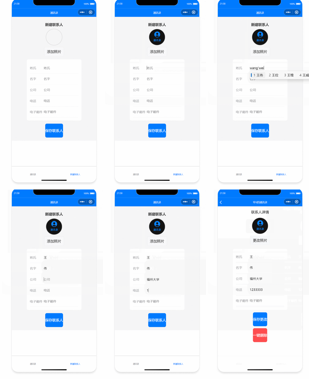
View and modify existing contact information
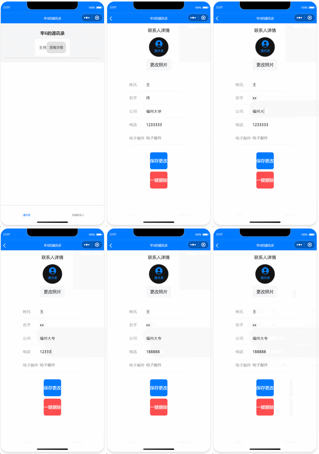
One-click delete function
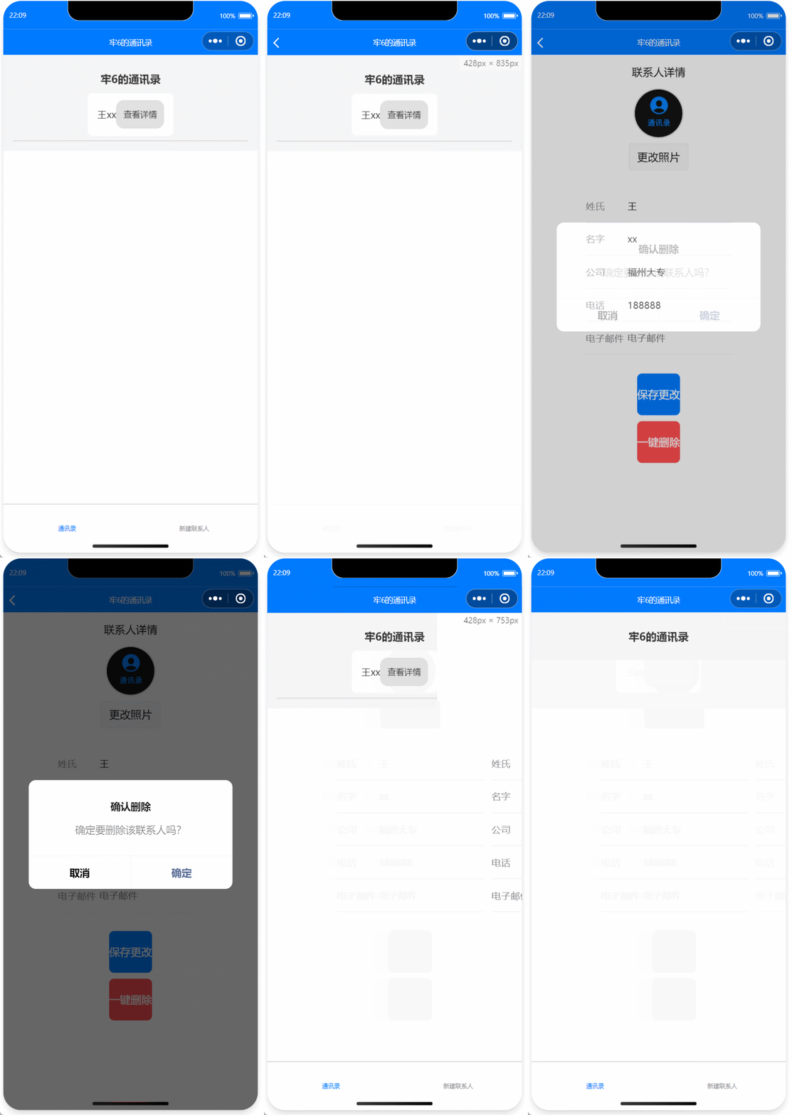
Interactive viewing of back-end (cloud) information
The front end gets information and uploads it to the back end in real time
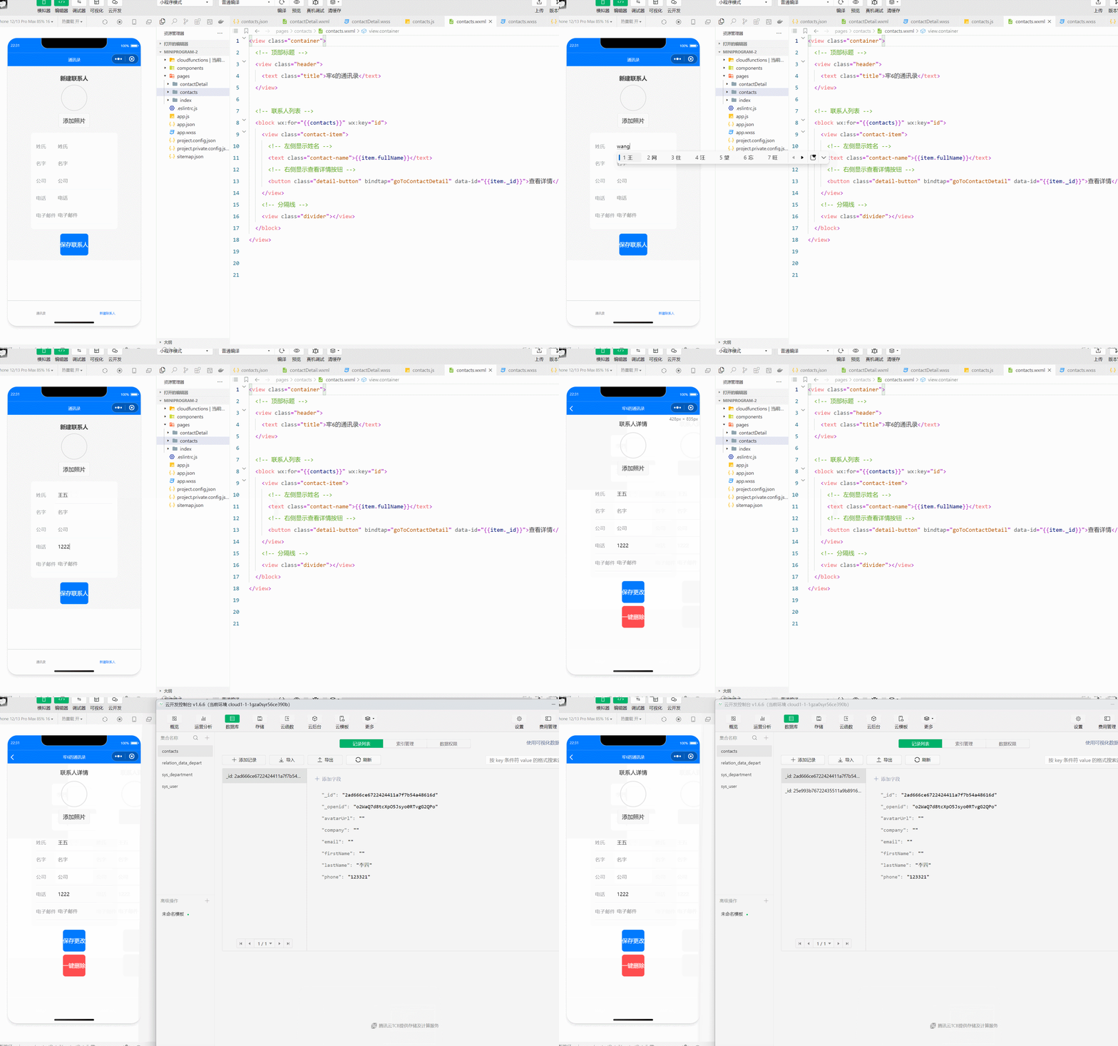
Including deletion, the information is also immediately reflected in the database
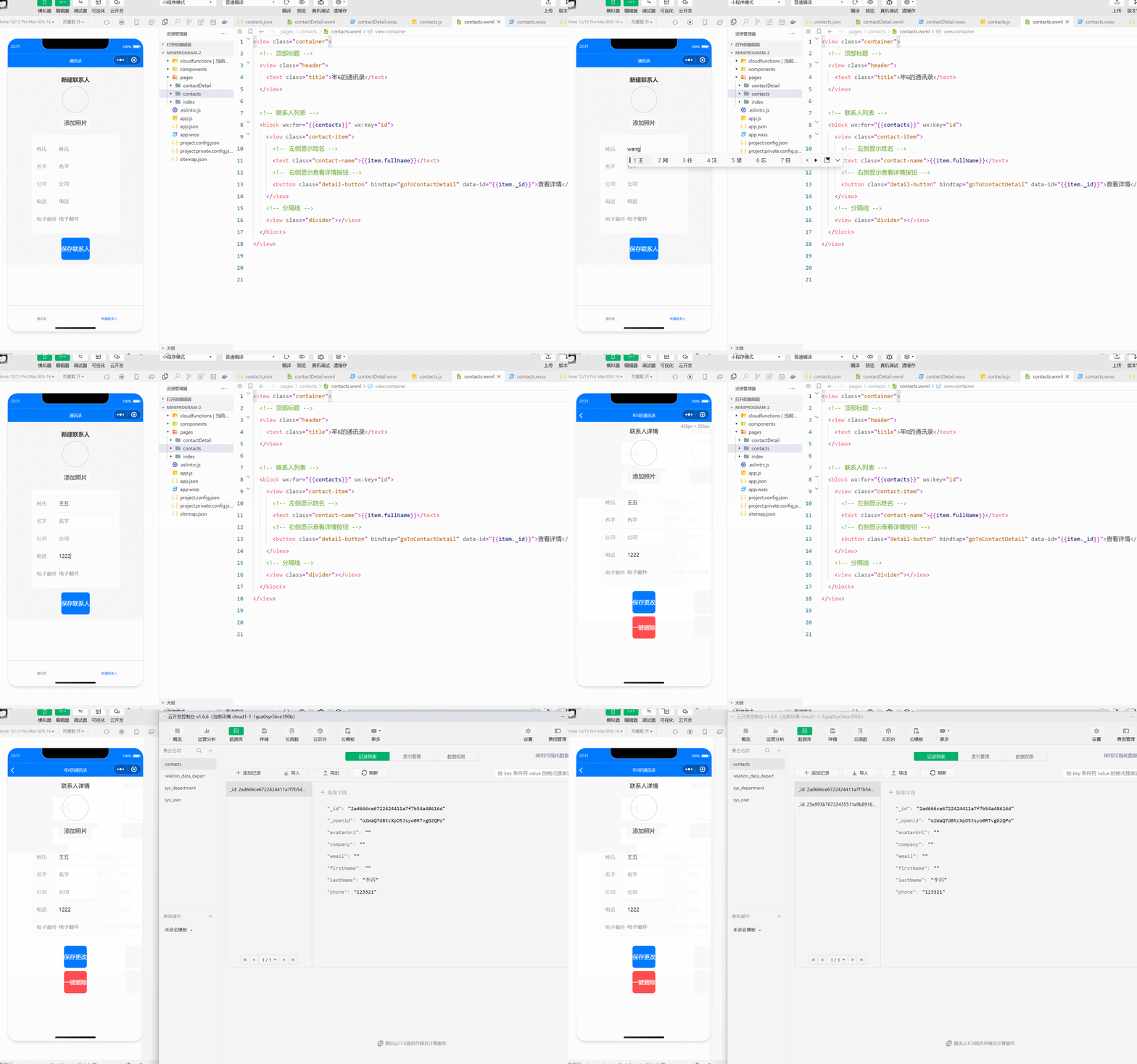
These are the basic functions.
5.Description of design and implementation process
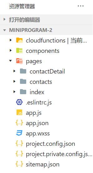
The diagram shows the framework of my entire project, which includes the cloud function file, the main file (contact details, contact directory and creating contacts (index)), and the global app file.
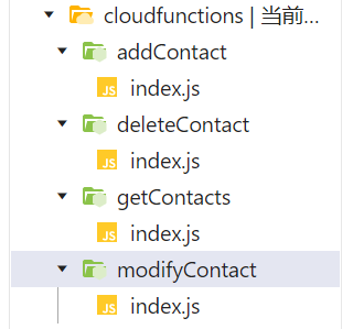
The Cloud Functions folder contains four modules: addContact,deleteContact,getContacts and modifyContact. Each corresponds to the four functions of their nameBecause the basic framework of these four functions is similar, the determination of the cloud function entry file and the setting of the cloud function entry function constitute the main part. Therefore, for one of the contents, addContact is explained here.
// 云函数入口文件 addContact
const cloud = require('wx-server-sdk');
cloud.init();

const db = cloud.database();

// 云函数入口函数
exports.main = async (event, context) => {
  const { name, phone } = event; // 从前端接收参数
  try {
    await db.collection('contacts').add({
      data: {
        name,
        phone
      }
    });
    return { success: true };
  } catch (e) {
    console.error('添加联系人失败:', e);
    return { success: false, error: e };
  }
};
const cloud = require('wx-server-sdk'); : Introduce the cloud development SDK of wechat mini program for connecting to the database.
cloud.init(); Initialize the cloud environment so that cloud functions can call databases and other cloud resources.
const db = cloud.database(); : Creates a database instance db for subsequent database operations.
exports.main = async (event, context) => {... } : Defines the entrance to the cloud function. const { name, phone } = event; : Deconstructs the event parameter from the front end and extracts the name and phone fields.
await db.collection('contacts').add(...) : Adds a new record to the contacts collection. data: {name, phone} : Specifies the content of the record, including name and phone number. return { success: true }; : If the record is successfully added, success: true is returned. catch an exception in a catch statement, print an error, and return success: false with an error message.
For the other three cloud functions, the functions of function initialization, data collection and return are consistent, with only some small differences in individual functions, not much explanation
The next step is to explain the design of the contacts page (index page)
**In index.wxml **
<view class="container">
  <view class="header">
    <text class="title">新建联系人</text>
  </view>

  <!-- 显示头像和上传按钮 -->
  <view class="avatar-section">
    <image class="avatar" src="{{avatarUrl || '/images/default-avatar.png'}}" mode="aspectFill"></image>
    <button bindtap="chooseAvatar">添加照片</button>
  </view>

  <!-- 输入框:姓、名、公司、电话、电子邮件 -->
  <view class="input-section">
    <view class="input-group">
      <text class="label">姓氏</text>
      <input class="input" placeholder="姓氏" bindinput="onLastNameInput" value="{{lastName}}" />
    </view>
    <view class="input-group">
      <text class="label">名字</text>
      <input class="input" placeholder="名字" bindinput="onFirstNameInput" value="{{firstName}}" />
    </view>
    <view class="input-group">
      <text class="label">公司</text>
      <input class="input" placeholder="公司" bindinput="onCompanyInput" value="{{company}}" />
    </view>
    <view class="input-group">
      <text class="label">电话</text>
      <input class="input" placeholder="电话" bindinput="onPhoneInput" value="{{phone}}" />
    </view>
    <view class="input-group">
      <text class="label">电子邮件</text>
      <input class="input" placeholder="电子邮件" bindinput="onEmailInput" value="{{email}}" />
    </view>
  </view>

  <!-- 保存按钮 -->
  <button class="save-btn" bindtap="saveContact">保存联系人</button>
</view>
The view class="container" serves as the main wrapper, organizing the entire page layout. Each view class="input-group" represents a section for a specific piece of contact information, such as surname, given name, and phone number. Inside each input-group, there’s a text class="label" for the field name (like "Last Name") and an input element where users enter data. The placeholder attribute in input displays a hint when the field is empty, and bindinput triggers JavaScript functions (e.g., onLastNameInput) to capture input in real-time, ensuring that the values entered by users are stored in the page’s data model.
The value="{{lastName}}" (or firstName, phone) binds each field to a specific data property, so changes are immediately reflected in the UI and data model. This two-way binding is crucial for dynamic updates.
Finally, the button class="save-btn" bindtap="saveContact" element serves as the submit button. The bindtap attribute links the button to the saveContact function, which executes when the button is tapped. This function will typically send the input data to a cloud database, completing the data entry process and updating the contact list.
In index.wxss
.container {
  padding: 16px;
  background-color: #f5f5f5;
}

.header {
  text-align: center;
  padding: 10px 0;
  font-size: 18px;
  font-weight: bold;
  color: #333;
}

.avatar-section {
  display: flex;
  flex-direction: column;
  align-items: center;
  margin-bottom: 16px;
}

.avatar {
  width: 80px;
  height: 80px;
  border-radius: 50%;
  margin-bottom: 8px;
  border: 2px solid #ddd;
}

.input-section {
  background-color: #ffffff;
  border-radius: 8px;
  padding: 16px;
  margin-bottom: 16px;
}

.input-group {
  display: flex;
  align-items: center;
  padding: 12px 0;
  border-bottom: 1px solid #e5e5ea;
}

.label {
  width: 70px;
  font-size: 16px;
  color: #8e8e93;
}

.input {
  flex: 1;
  font-size: 16px;
  padding: 4px 0;
}

.save-btn {
  background-color: #007aff;
  color: white;
  font-size: 18px;
  text-align: center;
  padding: 12px 0;
  border-radius: 8px;
}
.container: Sets overall padding and layout for the page, creating space around the elements and centering the content.
.input-group: Defines styling for each input section, including padding and alignment. It likely adds spacing between input fields and border separators for visual clarity.
.label: The class for
.input: Styles the input fields themselves. This might include font size, color, padding, and potentially a border or background color to visually separate the fields.
.save-btn: Styles the save button, setting background color (e.g., blue for prominence), text color (usually white), padding, border-radius for rounded edges, and alignment. It ensures the button stands out and is easy to click.
.delete-btn (if present): Applies a similar style to the save button but with a different color (often red) to indicate caution. This class styles the delete button in the detail page.
In index.js
const db = wx.cloud.database();

Page({
  data: {
    avatarUrl: '', // 头像路径
    lastName: '',
    firstName: '',
    company: '',
    phone: '',
    email: ''
  },

  // 选择头像
  chooseAvatar() {
    wx.chooseImage({
      count: 1,
      sizeType: ['compressed'],
      sourceType: ['album', 'camera'],
      success: res => {
        const filePath = res.tempFilePaths[0];
        this.setData({ avatarUrl: filePath });
      }
    });
  },

  // 输入框事件
  onLastNameInput(e) {
    this.setData({ lastName: e.detail.value });
  },

  onFirstNameInput(e) {
    this.setData({ firstName: e.detail.value });
  },

  onCompanyInput(e) {
    this.setData({ company: e.detail.value });
  },

  onPhoneInput(e) {
    this.setData({ phone: e.detail.value });
  },

  onEmailInput(e) {
    this.setData({ email: e.detail.value });
  },

  // 保存联系人并清空数据
  saveContact() {
    const { avatarUrl, lastName, firstName, company, phone, email } = this.data;

    db.collection('contacts').add({
      data: {
        avatarUrl,
        lastName,
        firstName,
        company,
        phone,
        email
      },
      success: res => {
        wx.showToast({ title: '保存成功', icon: 'success' });
        this.clearForm(); // 清空表单
        wx.navigateBack(); // 返回通讯录页面
      },
      fail: err => {
        wx.showToast({ title: '保存失败', icon: 'none' });
      }
    });
  },

  // 清空表单数据
  clearForm() {
    this.setData({
      avatarUrl: '',
      lastName: '',
      firstName: '',
      company: '',
      phone: '',
      email: ''
    });
  }
});
const db = wx.cloud.database();: Initializes the cloud database instance db, allowing this page to interact with the cloud database, such as adding or querying records
data: Defines the initial state of the page’s data properties, including:
avatarUrl: Stores the path for the avatar image.lastName, firstName, phone, email: Stores contact details to be input by the user
chooseAvatar function: Opens an image picker dialog to select a profile picture.
count: 1: Limits selection to one image.sizeType: ['compressed']: Requests a compressed image for faster upload.sourceType: ['album', 'camera']: Allows choosing from the photo album or taking a new photo.success: res => {...}: After the image is chosen, retrieves its local path (res.tempFilePaths[0]) and updates avatarUrl in data.
saveContact function: Saves the contact information, including avatar, to the database.
Data extraction: Uses destructuring to access avatarUrl, lastName, firstName, phone, and email from data.Database operation:fail callback: If saving fails, shows an error message with wx.showToast.success callback: Shows a success message with wx.showToast and navigates back to the previous page.data: Specifies the fields to store, mapping avatarUrl, lastName, firstName, phone, and email. db.collection('contacts').add({...}): Adds a new contact record to the contacts collection.
The above completes the explanation of the code in the index folder, in order to keep the blog as simple as possible, please go to github to see the detailed code.
Next, I will continue to explain the Contact page and the contactDetail page. As for the wxss page, because the content is very similar to index.wxss, I will pay more attention to the explanation of.js and.ml files
contact.js
const db = wx.cloud.database();

Page({
  data: {
    contacts: [],
  },

  onShow() {
    this.getContactsFromDB();
  },

  getContactsFromDB() {
    db.collection('contacts').get({
      success: res => {
        const contacts = res.data.map(contact => ({
          ...contact,
          fullName: `${contact.lastName}${contact.firstName}`
        }));
        this.setData({ contacts: contacts });
      }
    });
  },

  goToContactDetail(e) {
    const id = e.currentTarget.dataset.id;
    if (id) {
      wx.navigateTo({
        url: `/pages/contactDetail/contactDetail?id=${id}`
      });
    } else {
      wx.showToast({ title: '无法找到联系人详情', icon: 'none' });
    }
  }
});
Initialize Database:
const db = wx.cloud.database(); initializes a connection to the cloud database, allowing interaction with collections (in this case, contacts).
Data Object:
data: { contacts: [] } initializes an empty contacts array to store contact data fetched from the database.
onShow() Function:
Called each time the page is shown, it invokes getContactsFromDB() to refresh contact data.
getContactsFromDB() Function:
Fetches all documents from the contacts collection and maps each contact, adding a fullName property combining lastName and firstName. It then updates contacts in data to display the contact list.
goToContactDetail() Function:
Redirects to the contact detail page when a contact is selected. It retrieves the contact’s id from data-id and navigates to /pages/contactDetail/contactDetail?id=${id}, or shows an error if no id is found.
contact.wxml
<view class="container">
  <!-- 顶部标题 -->
  <view class="header">
    <text class="title">牢6的通讯录</text>
  </view>

  <!-- 联系人列表 -->
  <block wx:for="{{contacts}}" wx:key="id">
    <view class="contact-item">
      <!-- 左侧显示姓名 -->
      <text class="contact-name">{{item.fullName}}</text>
      <!-- 右侧显示查看详情按钮 -->
      <button class="detail-button" bindtap="goToContactDetail" data-id="{{item._id}}">查看详情</button>
    </view>
    <!-- 分隔线 -->
    <view class="divider"></view>
  </block>
</view>
Outer Container (view class="container"):
Wraps the entire contact list interface, setting up a consistent structure and applying styling for layout.
Title Section (view class="header"):
Displays a fixed title, “牢6的通讯录,” at the top of the page using a
Contact List Block (block wx:for="{{contacts}}" wx:key="id"):
Loops over the contacts data array, rendering each contact’s information. The wx:for directive iterates through contacts, with wx:key="id" ensuring that each item is uniquely identified by id, improving rendering performance.
Contact Item (view class="contact-item"):
Represents each contact entry in the list, with two key elements:Contact Name (text class="contact-name"{{item.fullName}}): Displays the full name of the contact, extracted from item.fullName within the contacts array.Details Button (查看详情): Adds a button labeled "查看详情" ("View Details") on the right side of each contact. The button triggers the goToContactDetail function when tapped, passing the contact’s unique _id as a data-id attribute, which helps identify the specific contact.
Divider (view class="divider"/view):
A styled separator line that visually separates each contact in the list, providing a clear distinction between entries for improved readability.
contactDetail.js
const db = wx.cloud.database();

Page({
  data: {
    contact: {}
  },

  onLoad(options) {
    const id = options.id;
    if (id) {
      this.getContactDetail(id);
    } else {
      wx.showToast({ title: '加载联系人失败', icon: 'none' });
    }
  },

  // 获取联系人详情
  getContactDetail(id) {
    db.collection('contacts').doc(id).get({
      success: res => {
        this.setData({ contact: res.data });
      },
      fail: err => {
        wx.showToast({ title: '加载失败', icon: 'none' });
      }
    });
  },

  // 修改头像
  changeAvatar() {
    const { contact } = this.data;

    wx.chooseImage({
      count: 1,
      sizeType: ['compressed'],
      sourceType: ['album', 'camera'],
      success: res => {
        const filePath = res.tempFilePaths[0];
        db.collection('contacts').doc(contact._id).update({
          data: { avatarUrl: filePath },
          success: () => {
            wx.showToast({ title: '头像更新成功', icon: 'success' });
            this.setData({ 'contact.avatarUrl': filePath });
          },
          fail: err => {
            wx.showToast({ title: '头像更新失败', icon: 'none' });
          }
        });
      }
    });
  },

  // 输入框事件处理
  onLastNameInput(e) {
    this.setData({ 'contact.lastName': e.detail.value });
  },

  onFirstNameInput(e) {
    this.setData({ 'contact.firstName': e.detail.value });
  },

  onCompanyInput(e) {
    this.setData({ 'contact.company': e.detail.value });
  },

  onPhoneInput(e) {
    this.setData({ 'contact.phone': e.detail.value });
  },

  onEmailInput(e) {
    this.setData({ 'contact.email': e.detail.value });
  },

  // 保存更改
  saveChanges() {
    const { contact } = this.data;
    db.collection('contacts').doc(contact._id).update({
      data: {
        lastName: contact.lastName,
        firstName: contact.firstName,
        company: contact.company,
        phone: contact.phone,
        email: contact.email
      },
      success: () => {
        wx.showToast({ title: '更新成功', icon: 'success' });
        wx.navigateBack();
      },
      fail: () => {
        wx.showToast({ title: '更新失败', icon: 'none' });
      }
    });
  },

  // 删除联系人
  deleteContact() {
    const { contact } = this.data;
    wx.showModal({
      title: '确认删除',
      content: '确定要删除该联系人吗?',
      success: (res) => {
        if (res.confirm) {
          db.collection('contacts').doc(contact._id).remove({
            success: res => {
              wx.showToast({ title: '删除成功', icon: 'success' });
              wx.navigateBack();
            },
            fail: err => {
              wx.showToast({ title: '删除失败', icon: 'none' });
            }
          });
        }
      }
    });
  }
});
Initialize Cloud Database:
const db = wx.cloud.database(); sets up a connection to the cloud database, allowing read/write operations on the contacts collection.
Data Object:
data: { contact: {} } initializes an empty contact object that will store contact details from the database.
onLoad Function:
Runs when the page loads. It extracts the contact id from options and calls getContactDetail to retrieve contact details, displaying an error if no id is found.
getContactDetail Function:
Fetches a specific contact’s details using their id. If successful, it stores this data in contact; otherwise, it displays an error.
Avatar Change Function:
changeAvatar: Allows users to select a new avatar image using wx.chooseImage, then updates avatarUrl in the database and local data to reflect the change.
Input Handling Functions:
onLastNameInput, onFirstNameInput, onCompanyInput, onPhoneInput, onEmailInput capture user inputs for various fields and store the values in the contact object. This makes the data ready for saving or updating.
Saving Changes:
saveChanges: Saves modified contact data to the database. It updates fields in contact and displays a success message upon completion.
Deleting Contact:
deleteContact: Shows a confirmation prompt and deletes the contact from the database if confirmed, displaying a success or failure message accordingly.
contactDetail.wxml
<view class="container">
  <view class="header">
    <text class="title">联系人详情</text>
  </view>

  <view class="avatar-section">
    <image class="avatar" src="{{contact.avatarUrl || '/images/default-avatar.png'}}" mode="aspectFill"></image>
    <button bindtap="changeAvatar">{{contact.avatarUrl ? '更改照片' : '添加照片'}}</button>
  </view>

  <view class="input-section">
    <view class="input-group">
      <text class="label">姓氏</text>
      <input class="input" placeholder="姓氏" bindinput="onLastNameInput" value="{{contact.lastName}}" />
    </view>
    <view class="input-group">
      <text class="label">名字</text>
      <input class="input" placeholder="名字" bindinput="onFirstNameInput" value="{{contact.firstName}}" />
    </view>
    <view class="input-group">
      <text class="label">公司</text>
      <input class="input" placeholder="公司" bindinput="onCompanyInput" value="{{contact.company}}" />
    </view>
    <view class="input-group">
      <text class="label">电话</text>
      <input class="input" placeholder="电话" bindinput="onPhoneInput" value="{{contact.phone}}" />
    </view>
    <view class="input-group">
      <text class="label">电子邮件</text>
      <input class="input" placeholder="电子邮件" bindinput="onEmailInput" value="{{contact.email}}" />
    </view>
  </view>

  <button class="save-btn" bindtap="saveChanges">保存更改</button>
  <button class="delete-btn" bindtap="deleteContact">一键删除</button>
</view>
Container (view class="container"): The outer wrapper for the contact details page layout, defining spacing and alignment.
Header (view class="header"): Displays the page title "联系人详情" at the top.
Avatar Section (view class="avatar-section"): Displays the contact's avatar. The src="{{contact.avatarUrl || '/images/default-avatar.png'}}" attribute checks if avatarUrl exists; if not, it defaults to /images/default-avatar.png. The mode="aspectFill" scales the image proportionally to fill the space.
Contact Info Section (view class="input-section"): Contains fields like last name, first name, company, phone, and email, each with:
Label (text class="label"): Shows the field’s name, e.g., "姓氏" or "电话".Info (text class="info"): Displays the actual data for each field using the contact object’s properties (e.g., contact.lastName).
Delete Button (button class="delete-btn" bindtap="deleteContact"): A button at the bottom labeled "一键删除". The bindtap="deleteContact" event calls the deleteContact function when clicked, enabling deletion of the contact.
This setup provides a structured contact details view with options to display, scale, and delete contact data.
6.brief summary
Creating this WeChat Mini Program has been a valuable learning experience, teaching me both the practical and conceptual aspects of front-end and back-end development. I gained hands-on experience with key tools and techniques, such as cloud database management, real-time data binding, and handling user interactions. Working through each stage of the app—structuring UI, implementing data handling, and integrating cloud functions—deepened my understanding of building responsive, user-friendly applications and sharpened my problem-solving skills when addressing challenges in functionality and design.
相关推荐
The Indispensable PC Hardware Book - rar - part1. (1/7)
主要内容:l CPU's from the 8086/8088 to the Pentium III and Athlon l Real, protected and virtual
Microsoft Visual C# 2013 Step by Step,最新资料
Your hands-on guide to Visual C# fundamentals Expand your expertise—and teach yourself the fundament
Python Cookbook, 2nd Edition
• Table of Contents • Index • Reviews • Reader Reviews • Errata • Academic Python Cookbook, 2
论文复现基于变频与移相协同控制的全桥LLC变换器模式切换平滑性优化(Simulink仿真实现)
内容概要:本文针对“基于变频与移相协同控制的全桥LLC变换器模式切换平滑性优化”这一主题,开展Simulink仿真实现与技术复现研究。通过构建全桥LLC谐振变换器的详细仿真模型,深入探讨在不同负载工况(如轻载、重载、待机与运行模式切换)下,如何结合变频控制(FM)与移相控制(PSM)的协同策略,优化系统动态响应的平稳性与效率。研究重点在于设计合理的控制逻辑,解决模式切换过程中可能出现的电压电流冲击问题,提升系统的稳定性和电能质量。文中系统阐述了控制策略的设计原理、关键参数的整定方法,并通过仿真结果验证了该协同控制方案在抑制瞬态扰动、实现无缝切换方面的有效性,完整复现了高水平学术论文中的核心技术路线,为电力电子变换器的先进控制提供了可复现的实践范例。; 适合人群:电力电子、电气工程及其自动化等相关专业的研究生、科研人员及从事开关电源、新能源变流器开发的工程师,尤其适合具备一定Simulink仿真经验与电力电子拓扑分析能力的专业人士; 使用场景及目标:①深入理解全桥LLC变换器在多模式运行下的变频与移相协同控制机理;②掌握在Simulink中对复杂谐振变换器进行建模、控制算法实现与仿真验证的全流程方法;③为学术论文写作、科研项目申报或高性能电源产品的工程开发提供可靠的技术参考与仿真基础; 阅读建议:建议结合所提供的Simulink模型文件与技术文档进行同步实践,重点关注变频与移相控制的切换逻辑、参数配合关系及过渡过程的动态特性,可通过调整负载条件观察系统的响应变化,以深化对模式切换平滑性实现机制的理解。
高校技术转移办公室人员如何高效完成科技成果全周期管理?.docx
科易网基于40亿+科创知识图谱数据库,深度探索AI技术在技术转移、成果转化、技术经纪、知识产权、产业创新、科技招商等垂直领域的多样化应用场景,研究科技创新领域的AI+数智化解决方案,推动科技创新与产业创新智能化发展。