


31
社区成员
 发帖
发帖 与我相关
与我相关 我的任务
我的任务
 分享
分享CSS3 是 CSS2 的升级版本,在 CSS2 的基础上新增了很多强大的新功能。
CSS3 新特性概览:
opacity 透明度div {
width: 400px;
height: 400px;
-webkit-border-radius: 20px; /* -webkit- 就是私有前缀;border-radius是一个圆角盒子属性 */
}
W3C 标准提出的某个 CSS 特性,在被浏览器正式支持前,浏览器厂商根据内核使用私有前缀来测试。
示例:
-webkit-border-radius: 20px;  /* Chrome/Safari */
-moz-border-radius: 20px;     /* Firefox */
-ms-border-radius: 20px;      /* IE/Edge */
-o-border-radius: 20px;       /* Opera */
border-radius: 20px;          /* 标准写法 */
查询兼容性: https://caniuse.com/
| 浏览器 | 私有前缀 |
|---|---|
| ==Chrome== | -webkit- |
| ==Safari== | -webkit- |
| Firefox | -moz- |
| ==Edge== | -webkit- |
| 旧 Opera | -o- |
| IE | -ms- |
注意: 实际开发中可借助构建工具自动添加私有前缀,无需手动记忆。
| 单位 | 含义 | |
|---|---|---|
rem | 根元素字体大小的倍数,只与根元素字体大小有关 | |
vw | ==视口宽度==的百分比(10vw = 视口宽度的10%) | 重要 |
vh | ==视口高度==的百分比(10vh = 视口高度的10%) | |
vmax | 视口宽高中较大值的百分比(了解即可) | |
vmin | 视口宽高中较小值的百分比(了解即可) |
rgba() - 红绿蓝 + 透明度hsl() - 色相、饱和度、亮度hsla() - 色相、饱和度、亮度 + 透明度注:这些在之前已详细讲解,此处略过。
注:这些在 CSS2 中已详细讲解,此处略过。
| 值 | 含义 |
|---|---|
content-box | width/height 设置==内容区大小==(默认值) |
border-box | width/height 设置==盒子总大小==(怪异盒模型) |
| 值 | 含义 |
|---|---|
none | 不允许调整(默认) |
both | 可调节宽度和高度,水平垂直都要 |
horizontal | 可调节宽度,水平方向上 |
vertical | 可调节高度,垂直方向上的 |
语法:
box-shadow: h-shadow v-shadow blur spread color inset;
| 值 | 含义 |
|---|---|
h-shadow | 水平阴影位置(必需,可为负值) |
v-shadow | 垂直阴影位置(必需,可为负值) |
blur | 模糊距离(可选) |
spread | 阴影外延值(可选) |
color | 阴影颜色(可选) |
inset | 将外阴影改为内阴影(可选) |
示例:
/* 两个值:水平位置、垂直位置 */
box-shadow: 10px 10px;

/* 三个值:水平位置、垂直位置、颜色 */
box-shadow: 10px 10px red;

/* 三个值:水平位置、垂直位置、模糊值 */
box-shadow: 10px 10px 10px;

/* 四个值:水平位置、垂直位置、模糊值、颜色 */
box-shadow: 10px 10px 10px red;

/* 五个值:水平、垂直、模糊、外延、颜色 */
box-shadow: 10px 10px 10px 10px blue;

/* 六个值:水平、垂直、模糊、外延、颜色、内阴影 */
box-shadow: 10px 10px 20px 3px blue inset;
就像”推动“
值范围:0(==完全透明==)~ 1(==完全不透明==)
作用:设置整个元素(包括内容)的不透明度
opacity与rgba的区别:
opacity是属性,设置整个元素的不透明度rgba是颜色设置方式,仅调整颜色的透明度
设置背景图的==原点==:
| 值 | 含义 | |
|---|---|---|
padding-box | 从 ==padding 区域==开始显示(默认值) | 即左上角的顶点 |
border-box | 从 ==border 区域==开始显示 | 盒子的最左点 |
content-box | 从 ==content 区域==开始显示 |
设置背景图的==裁剪==区域:
| 值 | 含义 | |
|---|---|---|
border-box | 从 border 区域裁剪(默认值) | 超过border以外的地方不显示 |
padding-box | 从 padding 区域裁剪 | 超过padding以外的地方不显示 |
content-box | 从 content 区域裁剪 | 超过content以外的地方不显示 |
text | 背景图只呈现在文字上(需加 -webkit- 前缀) |
设置背景图尺寸:
| 值 | 含义 | |
|---|---|---|
长度值 | 指定大小,如 300px 200px | 不允许负数 |
百分比 | 指定大小,如 100% 100% | 不允许负数 |
auto | 背景图片真实大小(==默认值==) | |
contain | 等比缩放,完整==包含==在容器内 | 可能会造成部分空缺 |
cover | 等比缩放,完全覆盖容器 | best的一种方法;背景图可能显示不完整 |
background: color url repeat position / size origin clip;
注意:
origin和clip值相同可只写一个size必须跟在position后面,用/分隔
background:
    url(../images/bg-lt.png) no-repeat left top,
    url(../images/bg-rt.png) no-repeat right top,
    url(../images/bg-lb.png) no-repeat left bottom,
    url(../images/bg-rb.png) no-repeat right bottom;
/* 同时设置四个角 */
border-radius: 10px;
| ![[Pasted image 20260806153447.png|159]] | 像素值就是这个圆的半径值 |
|---|---|
| r=盒子边长的一半时就变成一个正圆;或者直接写50% |
单独设置各角:
| 属性 | 作用 |
|---|---|
border-top-left-radius | 左上角圆角 |
border-top-right-radius | 右上角圆角 |
border-bottom-right-radius | 右下角圆角 |
border-bottom-left-radius | 左下角圆角 |
| ![[Pasted image 20260806153903.png|166]] | ![[Pasted image 20260806154235.png|169]] |
|---|---|
| 效果belike | border-top-left-radius: 100px 50px |
综合写法:
border-radius: 左上x 右上x 右下x 左下x / 左上y 右上y 右下y 左下y;
| 属性 | 含义 | |
|---|---|---|
outline-width | 外轮廓宽度 | |
outline-color | 外轮廓颜色 | |
outline-style | 外轮廓风格(none/dotted/dashed/solid/double) | |
outline-offset | 外轮廓与边框距离(==独立属性==) | 可以为负数 |
/* 复合写法 */
outline: 50px solid blue;
text-shadow: h-shadow v-shadow blur color;
| 值 | 描述 |
|---|---|
h-shadow | 水平阴影位置(必需) |
v-shadow | 垂直阴影位置(必需) |
blur | 模糊距离(可选) |
color | 阴影颜色(可选) |
| 值 | 含义 | |
|---|---|---|
normal | 自动换行(默认值) | |
pre | ==原样输出==(类似 <pre> 标签) | |
pre-wrap | 原样输出 + 自动换行 | |
pre-line | 识别换行,忽略空格 + 自动换行 | 只认识换行,空格会忽略 |
nowrap | ==强制不换行== |
| 值 | 含义 |
|---|---|
clip | 裁切溢出部分(默认值) |
ellipsis | 溢出部分替换为 ... |
注意: 需要配合
overflow: hidden和white-space: nowrap使用
text-decoration: line || style || color;
| 子属性 | 含义 |
|---|---|
text-decoration-line | none / underline / overline / line-through |
text-decoration-style | solid / double / dotted / dashed / wavy |
text-decoration-color | 颜色值 |
-webkit-text-stroke-width: 2px;
-webkit-text-stroke-color: red;
/* 复合写法 */
-webkit-text-stroke: 2px red;
/* 使用角度 */
background-image: linear-gradient(30deg, red, yellow, green);指的角度,顺时针旋转30度
/* 调整渐变起始位置 */
background-image: linear-gradient(red 50px, yellow 100px, green 150px);调整渐变的位置(y轴)50px时必须是纯红色。。依旧可以调整角度
#### 8.2 径向渐变
| | | |
| ------ | ------------------------------------ | ------------- |
| 径向渐变展示 | 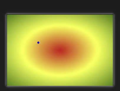 | 形状和box的设置宽高有关 |
```css
/* 默认从圆心四散 */
background-image: radial-gradient(red, yellow, green); 从里往外
/* 调整圆心位置 */
background-image: radial-gradient(at right top, red, yellow, green);
background-image: radial-gradient(at 100px 50px, red, yellow, green);
/* 正圆 */
background-image: radial-gradient(circle, red, yellow, green);
/* 调整半径 */
background-image: radial-gradient(100px, red, yellow, green);
background-image: radial-gradient(50px 100px, red, yellow, green);
/* 调整渐变起始位置 */
background-image: radial-gradient(red 50px, yellow 100px, green 150px);
/* 重复径向渐变 */
background-image: repeating-radial-gradient(red, yellow 10px, green 20px);
---

### 9. Web 字体

#### 9.1 基本用法

```css
/* 简写方式 */
@font-face {
    font-family: "情书字体";
    src: url('./方正手迹.ttf');
}

/* 高兼容性写法 */
@font-face {
    font-family: "atguigu";
    font-display: swap;
    src: url('webfont.eot'); /* IE9 */
    src: url('webfont.eot?#iefix') format('embedded-opentype'), /* IE6-IE8 */
        url('webfont.woff2') format('woff2'),
        url('webfont.woff') format('woff'),
        url('webfont.ttf') format('truetype'),
        url('webfont.svg#webfont') format('svg'); /* iOS 4.1- */
}
中文字体文件很大,可针对个别文字定制:
阿里图标库: https://www.iconfont.cn/
前提: 二维坐标系
| 值 | 含义 |
|---|---|
translateX() | 水平位移(百分比参考自身宽度) |
translateY() | 垂直位移(百分比参考自身高度) |
translate(x, y) | 同时设置水平和垂直位移 |
transform: translateX(30px) translateY(40px);
注意点:
配合定位实现水平垂直居中:
.box {
    position: absolute;
    left: 50%;
    top: 50%;
    transform: translate(-50%, -50%);
}
| 值 | 含义 |
|---|---|
scaleX(n) | 水平缩放比例 |
scaleY(n) | 垂直缩放比例 |
scale(n) | 同时设置水平和垂直 |
scale(x, y) | 分别设置水平和垂直 |
值 > 1 放大,值 < 1 缩小,= 1 不缩放
注意: 支持负数但几乎不用;可借助缩放实现小于 12px 的文字。
transform: rotate(45deg); /* 正值顺时针,负值逆时针 */
| 值 | 含义 |
|---|---|
skewX(angle) | 水平扭曲 |
skewY(angle) | 垂直扭曲 |
skew(x, y) | 同时设置 |
/* 可同时使用多个变换(建议最后旋转) */
transform: translate(-50%, -50%) rotate(45deg);
/* 默认在元素中心 */
transform-origin: 50% 50%;

/* 左上角 */
transform-origin: left top;

/* 自定义位置 */
transform-origin: 50px 50px;
重要原则: 父元素必须开启 3D 空间!
transform-style: flat;        /* 2D 空间(默认) */
transform-style: preserve-3d; /* 3D 空间 */
景深:观察者与 z=0 平面的距离,产生透视效果。(给父元素加)
perspective: none;   /* 默认 没有景深 */
perspective: 800px;  /* 长度值,不允许负值 */
设置给发生 3D 变换元素的父元素!
/* 默认在元素中心 */
perspective-origin: 400px 300px;
通常情况下不需要调整。
| 值 | 含义 |
|---|---|
translateZ() | Z 轴位移(正值向外,负值向里,不能写百分比) |
translate3d(x, y, z) | 同时设置三个轴(参数不能省略) |
| 值 | 含义 |
|---|---|
rotateX(angle) | 绕 X 轴旋转 |
rotateY(angle) | 绕 Y 轴旋转 |
rotate3d(x, y, z, angle) | 绕自定义轴旋转 |
| 值 | 含义 |
|---|---|
scaleZ(n) | Z 轴缩放 |
scale3d(x, y, z) | 三个轴同时缩放 |
backface-visibility: visible;  /* 可见(默认) */
backface-visibility: hidden;   /* 不可见 */
指定需要过渡的属性:
| 值 | 含义 |
|---|---|
none | 不过渡任何属性 |
all | 过渡所有能过渡的属性(默认) |
属性名 | 指定具体属性,多个用逗号分隔 |
支持过渡的属性: 颜色、长度值、百分比、z-index(调整层级)、opacity、2D/3D 变换属性、阴影
不是所有属性都支持过渡,只有值为数字,或者值能转为数字的属性,都支持过渡,否则不支持过渡
设置过渡持续时间:0(默认)/ s / ms
默认没有过渡时间
设置过渡延迟时间:s / ms
| 值 | 含义 |
|---|---|
ease | 平滑过渡(默认) |
linear | 线性过渡 |
ease-in | 慢 → 快 |
ease-out | 快 → 慢 |
ease-in-out | 慢 → 快 → 慢 |
step-start | 等同于 steps(1, start) |
step-end | 等同于 steps(1, end) |
steps(n, start/end) | 步进函数 |
cubic-bezier() | 贝塞尔曲线 |
/* 一个时间 = duration;两个时间 = duration + delay */
transition: 1s 1s linear all;
一段动画由若干帧组成,关键帧是起决定性作用的 2-3 帧。每一个图片就叫一帧。帧越多动画越流畅,一秒24帧适合人眼。
/* 完整方式 /
@keyframes 动画名 {
0% { / 样式 / }
20% { / 样式 / }
40% { / 样式 / }
60% { / 样式 / }
80% { / 样式 / }
100% { / 样式 */ }
}
- 两种方式可以混用但是不建议
#### 13.3 应用动画
1.animation-name:给元素指定具体的动画(具体的关键帧)
2.animation-duration:设置动画所需要的时间
3.animation-delay:设置动画延迟
```css
.box {
    animation-name: testKey;        /* 指定动画 */
    animation-duration: 5s;         /* 持续时间 */
    animation-delay: 0.5s;          /* 延迟时间 */
    animation-timing-function: ease; /* 动画类型 */
    animation-iteration-count: infinite; /* 播放次数 */
    animation-direction: alternate; /* 动画方向 */
    animation-fill-mode: forwards;  /* 结束状态 */
    animation-play-state: running;  /* 播放状态 */
}
1.ease:平滑动画——默认值
2.linear:线性过渡
3.ease-in:慢-快
4.ease-out:快-慢
5.ease-in-out:慢-快-慢
6.step-start:等同于steps(1,start)
7.step-end:等同于steps(1,end)
8.steps( integer,?):接受两个参数的步进函数。第一个参数必须为正整数,指定函数的步数。
9.cubic-bezie:特定的贝塞尔曲线类型,有相应地转换网站。贝塞尔曲线|cubic-bezier - css工具
1.number:动画循环次数
2.infinite:无限循环
/* 一个时间 = duration;两个时间 = duration + delay */
.inner {
    animation: atguigu 3s 0.5s linear 2 alternate-reverse forwards;
}
animation-play-state一般单独使用。
用于实现类似报纸的布局:
| 属性 | 含义 |
|---|---|
column-count | 列数 |
column-width | 列宽 |
columns | 同时指定列宽和列数 |
column-gap | 列边距 |
column-rule-style | 列边框风格 |
column-rule-width | 列边框宽度 |
column-rule-color | 列边框颜色 |
column-rule | 列边框复合属性 |
column-span | 是否跨列(none / all) |
2009 年 W3C 提出的新盒子模型,可轻松控制元素分布、对齐和视觉顺序。
现状: 除部分 IE 外,所有浏览器均已支持。
display: flex;        /* 块级伸缩容器 */
display: inline-flex; /* 行内伸缩容器 */
| 值 | 含义 |
|---|---|
row | 水平从左到右(默认) |
row-reverse | 水平从右到左 |
column | 垂直从上到下 |
column-reverse | 垂直从下到上 |
| 值 | 含义 |
|---|---|
nowrap | 不换行(默认) |
wrap | 自动换行 |
wrap-reverse | 反向换行 |
flex-flow: row wrap; /* flex-direction + flex-wrap */
| 值 | 含义 |
|---|---|
flex-start | 起点对齐(默认) |
flex-end | 终点对齐 |
center | 居中对齐 |
space-between | 均匀分布,两端对齐(最常用) |
space-around | 均匀分布,两端距离是中间的一半 |
space-evenly | 均匀分布,所有间距相等 |
| 值 | 含义 |
|---|---|
flex-start | 起点对齐 |
flex-end | 终点对齐 |
center | 居中对齐 |
baseline | 基线对齐 |
stretch | 占满容器高度(默认) |
| 值 | 含义 |
|---|---|
flex-start | 起点对齐 |
flex-end | 终点对齐 |
center | 居中对齐 |
space-between | 两端对齐 |
space-around | 间距相等,距边缘大一倍 |
space-evenly | 完全平分 |
stretch | 占满侧轴(默认) |
方法一:
.outer {
    display: flex;
    justify-content: center;
    align-items: center;
}
方法二:
.outer {
    display: flex;
}
.inner {
    margin: auto;
}
flex-basis - 基准长度
autoflex-grow - 放大比例
0(不拉伸)flex-shrink - 压缩比例
1(空间不足时缩小)flex: 0 1 auto; /* 默认值 */
/* 简写 */
flex: auto; /* = 1 1 auto */
flex: 1; /* = 1 1 0 */
flex: none; /* = 0 0 auto */
flex: 0 auto; /* = 0 1 auto(初始值) */
order: 数值; /* 数值越小越靠前,默认为 0 */
align-self: auto; /* 继承父元素的 align-items(默认) */
align-self: flex-start / flex-end / center / stretch / baseline;
| 值 | 含义 |
|---|---|
all | 所有设备 |
screen | 电子屏幕 |
print | 打印机 |
完整列表:https://developer.mozilla.org/zh-CN/docs/Web/CSS/@media@media
| 值 | 含义 |
|---|---|
width | 视口宽度 |
max-width | 视口最大宽度 |
min-width | 视口最小宽度 |
height | 视口高度 |
orientation | 视口方向(portrait/landscape) |
| 运算符 | 含义 |
|---|---|
and | 并且 |
, 或 or | 或 |
not | 否定 |
only | 肯定 |
| 区间 | 设备类型 |
|---|---|
| < 768px | 手机 |
| 768px ~ 1200px | 平板/小屏 |
| > 1200px | 桌面 |
<!-- 外部样式 -->
<link rel="stylesheet" media="screen and (max-width:768px)" href="mystylesheet.css">
/* 内部样式 */
@media screen and (max-width: 768px) {
    /* CSS 代码 */
}

@media screen and (min-width: 768px) and (max-width: 1200px) {
    /* CSS 代码 */
}
BFC 是 Block Formatting Context 的缩写,可以理解成元素的一个"特异功能",默认关闭,满足条件后激活。
| 条件 | 示例 |
|---|---|
| 根元素 | <html> |
| 浮动元素 | float: left/right |
| 绝对/固定定位 | position: absolute/fixed |
| 行内块元素 | display: inline-block |
| 表格单元格 | display: table-cell 等 |
| overflow 不为 visible | overflow: hidden/auto/scroll |
| 伸缩项目 | display: flex 的子元素 |
| 多列容器 | column-count 或 column-width |
| 专门属性 | display: flow-root |


