


8,735
社区成员
 发帖
发帖 与我相关
与我相关 我的任务
我的任务
 分享
分享
 public class XTreeViewItem : TreeViewItem,Interfaces.IIcon
    {
        static XTreeViewItem()
        {
            DefaultStyleKeyProperty.OverrideMetadata(typeof(XTreeViewItem), new FrameworkPropertyMetadata(typeof(XTreeViewItem)));

        }

        #region Event

        ///// <summary>
        ///// 处理各种路由事件的方法
        ///// </summary>
        //[Category("Behavior")]
        //public event MouseEventHandler Click
        //{
        //    //将路由事件添加路由事件处理程序
        //    add { AddHandler(ClickedEvent, value); }
        //    //从路由事件处理程序中移除路由事件
        //    remove { RemoveHandler(ClickedEvent, value); }
        //}
        //public static readonly RoutedEvent ClickedEvent = EventManager.RegisterRoutedEvent("Click", RoutingStrategy.Bubble, typeof(MouseEventHandler), typeof(XTreeViewItem));

        #endregion
        public override void OnApplyTemplate()
        {
            base.OnApplyTemplate();

            //MouseEnter += XTreeViewItem_MouseEnter;
            //MouseLeave += XTreeViewItem_MouseLeave;
        }

        //private void XTreeViewItem_MouseLeave(object sender, MouseEventArgs e)
        //{
        //    (e.OriginalSource as XTreeViewItem).Background = new SolidColorBrush((Color)ColorConverter.ConvertFromString("#FFF4F4F4"));

        //    if ((e.OriginalSource as XTreeViewItem).Parent is XTreeViewItem)
        //    {
        //        ((e.OriginalSource as XTreeViewItem).Parent as ItemsControl).MouseEnter += XTreeViewItem_MouseEnter;
        //    }
        //}

        //private void XTreeViewItem_MouseEnter(object sender, MouseEventArgs e)
        //{
        //    (e.OriginalSource as XTreeViewItem).Background = new SolidColorBrush((Color)ColorConverter.ConvertFromString("#FFEAEAEA"));

        //    if((e.OriginalSource as XTreeViewItem).Parent is XTreeViewItem)
        //    {
        //        ((e.OriginalSource as XTreeViewItem).Parent as ItemsControl).MouseEnter -= XTreeViewItem_MouseEnter;
        //    }
        //}


        #region DependencyProperty
        /// <summary>
        /// 标题
        /// </summary>
        public string Title
        {
            get => (string)GetValue(TitleProperty);
            set => SetValue(TitleProperty, value);
        }
        public static readonly DependencyProperty TitleProperty = DependencyProperty.Register("Title", typeof(string), typeof(XTreeViewItem), new PropertyMetadata(""));

        /// <summary>
        /// 右侧数量
        /// </summary>
        public string Quantity
        {
            get => (string)GetValue(QuantityProperty);
            set => SetValue(QuantityProperty, value);
        }
        public static readonly DependencyProperty QuantityProperty = DependencyProperty.Register("Quantity", typeof(string), typeof(XTreeViewItem), new PropertyMetadata(""));

        /// <summary>
        /// 外部图标
        /// </summary>
        public ImageSource IconSource
        {
            get => (ImageSource)GetValue(IconSourceProperty);
            set => SetValue(IconSourceProperty, value);
        }
        public static readonly DependencyProperty IconSourceProperty = DependencyProperty.Register("IconSource", typeof(ImageSource), typeof(XTreeViewItem), new PropertyMetadata(null));

        /// <summary>
        /// 内部图标
        /// </summary>
        public Icons Icon { get => throw new NotImplementedException(); set => throw new NotImplementedException(); }
        public static readonly DependencyProperty IconProperty = DependencyProperty.Register("Icon", typeof(Icons), typeof(XTreeViewItem),Helper.IconHelper.CreateIconChangeHandler(Icons.None));

        /// <summary>
        /// 这个节点是否是按钮
        /// </summary>
        public bool IsButton
        {
            get => (bool)GetValue(IsButtonProperty);
            set => SetValue(IsButtonProperty, value);
        }
        public static readonly DependencyProperty IsButtonProperty = DependencyProperty.Register("IsButton", typeof(bool), typeof(XTreeViewItem), new PropertyMetadata(false));
        #endregion
    }
<Style TargetType="{x:Type local:XTreeViewItem}">
        <!--适配DPI-->
        <Setter Property="SnapsToDevicePixels" Value="True"/>

        <!--默认字体色-->
        <Setter Property="Foreground" Value="#333"/>

        <!--默认背景色-->
        <Setter Property="Background" Value="#FFF4F4F4"/>

        <Setter Property="Cursor" Value="Hand"/>

        <Setter Property="FontSize" Value="12px"/>
        <Setter Property="HorizontalContentAlignment" Value="{Binding HorizontalContentAlignment, RelativeSource={RelativeSource AncestorType={x:Type ItemsControl}}}"/>
        <Setter Property="VerticalContentAlignment" Value="{Binding VerticalContentAlignment, RelativeSource={RelativeSource AncestorType={x:Type ItemsControl}}}"/>
        <Setter Property="Template">
            <Setter.Value>
                <ControlTemplate TargetType="{x:Type local:XTreeViewItem}">
                    <!--当小于150px是另一种样式-->
                    <Grid>
                        <Grid.RowDefinitions>
                            <RowDefinition Height="auto"/>
                            <RowDefinition Height="auto"/>
                        </Grid.RowDefinitions>
                        <Border
                            BorderThickness="0"
                            Background="Transparent"
                                 x:Name="Border">
                            <Grid Width="212px"
                          Grid.Row="0"
                                  Background="{Binding RelativeSource={RelativeSource Mode=TemplatedParent},Path=Background}"
                          x:Name="body"
                          Height="30px">
                                <Grid.ColumnDefinitions>
                                    <ColumnDefinition Width="40px"/>
                                    <ColumnDefinition Width="*"/>
                                    <ColumnDefinition Width="40px"/>
                                </Grid.ColumnDefinitions>
                                <StackPanel x:Name="Title"
                                    Grid.Column="1"
                                    VerticalAlignment="Center"
                                    HorizontalAlignment="Left">
                                    <TextBlock Text="{TemplateBinding Title}" FontSize="{TemplateBinding FontSize}"/>
                                </StackPanel>
                                <StackPanel x:Name="Quantity"
                                    Grid.Column="2"
                                        Panel.ZIndex="1"
                                    VerticalAlignment="Center"
                                    HorizontalAlignment="Right"
                                    Margin="0 0 25px 0">
                                    <TextBlock Text="{TemplateBinding Quantity}" FontSize="{TemplateBinding FontSize}"/>
                                </StackPanel>
                                <StackPanel x:Name="Icon"
                                    Grid.Column="2"
                                    Panel.ZIndex="2"
                                    Visibility="Collapsed"
                                    Orientation="Horizontal"
                                    VerticalAlignment="Center">
                                    <Image Margin="17px 0 12px 0"
                                   Source="{TemplateBinding IconSource}"
                                   Width="12px"
                                   Height="12px"
                                   VerticalAlignment="Center"
                                   HorizontalAlignment="Center"/>
                                </StackPanel>
                            </Grid>
                        </Border>
                        <ItemsPresenter  x:Name="ItemsPresenter" Grid.Row="1" />
                    </Grid>
                    <ControlTemplate.Triggers>
                        <Trigger Property="IsMouseOver" Value="True">
                            <Setter Property="Background" Value="#FFEAEAEA"/>
                        </Trigger>
                        <Trigger Property="IsMouseOver" Value="False">
                            <Setter Property="Background" Value="#FFF4F4F4"/>
                        </Trigger>
                    </ControlTemplate.Triggers>
                </ControlTemplate>
            </Setter.Value>
        </Setter>

    </Style>
<uiLib:XTreeViewItem FontSize="12px" Title="test" Quantity="1">
                    <uiLib:XTreeViewItem FontSize="12px" Title="test2" Quantity="2"/>
                    <uiLib:XTreeViewItem FontSize="12px" Title="test3" Quantity="2"/>
                    <uiLib:XTreeViewItem FontSize="12px" Title="test4" Quantity="2"/>
                </uiLib:XTreeViewItem>

<Window
xmlns="http://schemas.microsoft.com/winfx/2006/xaml/presentation"
xmlns:x="http://schemas.microsoft.com/winfx/2006/xaml">
<Window.Resources>
<Style TargetType="{x:Type TreeView}">
<Setter Property="Background" Value="Transparent"></Setter>
<Setter Property="BorderBrush" Value="Transparent"></Setter>
<Setter Property="Foreground" Value="Transparent"></Setter>
<Setter Property="BorderThickness" Value="0"></Setter>
<Setter Property="VirtualizingStackPanel.IsVirtualizing" Value="True"></Setter>
<Setter Property="VirtualizingStackPanel.VirtualizationMode" Value="Recycling"></Setter>
<Setter Property="Margin" Value="5"></Setter>
<Style.Resources>
<Style TargetType="{x:Type TreeViewItem}">
<Setter Property="HorizontalContentAlignment" Value="{Binding HorizontalContentAlignment, RelativeSource={RelativeSource AncestorType={x:Type ItemsControl}}}"/>
<Setter Property="VerticalContentAlignment" Value="{Binding VerticalContentAlignment, RelativeSource={RelativeSource AncestorType={x:Type ItemsControl}}}"/>
<Setter Property="Padding" Value="0,0,0,0"/>
<Setter Property="IsExpanded" Value="true"></Setter>
<Setter Property="MinWidth" Value="200"></Setter>
<Setter Property="Template">
<Setter.Value>
<ControlTemplate TargetType="{x:Type TreeViewItem}">
<Grid>
<Grid.ColumnDefinitions>
<ColumnDefinition MinWidth="19" Width="Auto"/>
<ColumnDefinition Width="Auto"/>
<ColumnDefinition Width="*"/>
</Grid.ColumnDefinitions>
<Grid.RowDefinitions>
<RowDefinition Height="Auto"/>
<RowDefinition/>
</Grid.RowDefinitions>
<ToggleButton x:Name="Expander" Margin="-1,0,0,0" Panel.ZIndex="2" ClickMode="Press" IsChecked="{Binding IsExpanded, RelativeSource={RelativeSource TemplatedParent}}"/>
<Border x:Name="Bd" Width="{TemplateBinding MinWidth}" Grid.Column="1" BorderBrush="{TemplateBinding BorderBrush}" BorderThickness="{TemplateBinding BorderThickness}" Background="{TemplateBinding Background}" SnapsToDevicePixels="true"
>
<ContentPresenter VerticalAlignment="Bottom" x:Name="PART_Header" ContentSource="Header" HorizontalAlignment="{TemplateBinding HorizontalContentAlignment}" SnapsToDevicePixels="{TemplateBinding SnapsToDevicePixels}"
/>
</Border>
<ItemsPresenter x:Name="ItemsHost" Margin="0,0,0,0" Grid.ColumnSpan="2" Grid.Column="1" Grid.Row="1"/>
</Grid>
<ControlTemplate.Triggers>
<Trigger Property="IsExpanded" Value="false">
<Setter Property="Visibility" TargetName="ItemsHost" Value="Collapsed"/>
</Trigger>
<Trigger Property="IsExpanded" Value="true">
<Setter Property="Visibility" TargetName="ItemsHost" Value="Visible"/>
</Trigger>
<Trigger Property="HasItems" Value="false">
<Setter Property="Visibility" TargetName="Expander" Value="Hidden"/>
</Trigger>
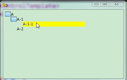
<Trigger Property="IsSelected" Value="true">
<Setter Property="Background" TargetName="Bd" Value="Red"/>
</Trigger>
<MultiTrigger>
<MultiTrigger.Conditions>
<Condition Property="IsSelected" Value="False"></Condition>
<Condition Property="IsMouseOver" SourceName="Bd" Value="True"/>
</MultiTrigger.Conditions>
<Setter Property="Background" TargetName="Bd" Value="Yellow"/>
<Setter Property="TextElement.Foreground" TargetName="PART_Header" Value="Blue"></Setter>
</MultiTrigger>
</ControlTemplate.Triggers>
</ControlTemplate>
</Setter.Value>
</Setter>
</Style>
</Style.Resources>
</Style>
</Window.Resources>
<Grid>
<TreeView>
<TreeViewItem Header="A" >
<TreeViewItem Header="A-1">
<TreeViewItem Header="A-1-1"></TreeViewItem>
</TreeViewItem>
<TreeViewItem Header="A-2"></TreeViewItem>
</TreeViewItem>
</TreeView>
</Grid>
</Window>
